United States Court of Appeals & Parallel Tag Clouds from IBM Research

Ct of Appeals

Download the paper: Collins, Christopher; Viégas, Fernanda B.; Wattenberg, Martin. Parallel Tag Clouds to Explore Faceted Text Corpora To appear in Proceedings of the IEEE Symposium on Visual Analytics Science and Technology (VAST), October, 2009. [Note: The Paper is 24.5 MB]

Here is the abstract: Do court cases differ from place to place? What kind of picture do we get by looking at a country’s collection of law cases? We introduce Parallel Tag Clouds: a new way to visualize differences amongst facets of very large metadata-rich text corpora. We have pointed Parallel Tag Clouds at a collection of over 600,000 US Circuit Court decisions spanning a period of 50 years and have discovered regional as well as linguistic differences between courts. The visualization technique combines graphical elements from parallel coordinates and traditional tag clouds to provide rich overviews of a document collection while acting as an entry point for exploration of individual texts. We augment basic parallel tag clouds with a details-in-context display and an option to visualize changes over a second facet of the data, such as time. We also address text mining challenges such as selecting the best words to visualize, and how to do so in reasonable time periods to maintain interactivity.

The Map of the Future [From Densitydesign.org]

Map of the Future

Picture 7As we mentioned in previous posts, Seadragon is a really cool product. Please note load times may vary depending upon your specific machine configuration as well as the strength of your internet connection. For those not familiar with how to operate it please see below. In our view, the Full Screen is best the way to go ….

The Structure of the United States Code

United States Code (All Titles)

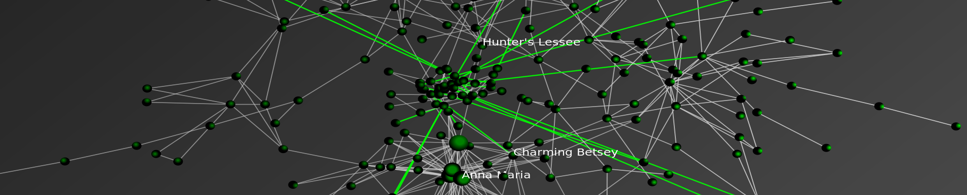
Formally organized into 50 titles, the United States Code is the repository for federal statutory law. While each of the 50 titles define a particular substantive domain, the structure within and across titles can be represent as a graph/network. In a series of prior posts, we offered visualizations at various “depths” for a number of well know U.S.C. titles. Click here and click Here for our two separate visualizations of the Tax Code (Title 26).  Click here for our visualization of the Bankruptcy Code (Title 11).  Click here for our visualization of Copyright (Title 17). While our prior efforts were devoted to displaying the structure of a given title of the US Code, the visualization above offers a complete view of the structure of the entire United States Code (Titles 1-50).

Using Seadragon from Microsoft Labs, each title is labeled with its respective number. The small black dots are “vertices” representing all sections in the aggregate US Code (~37,500 total sections). Given the size of the total undertaking, in the visual above, every title is represented to the “section level.”  As we described in earlier posts, a “section level” representation halts at the section and thus does not represent any of subsection depth.  For example, all sections under 26 U.S.C. § 501 including the well known § 501 (c) (3) are reattributed upward to their parent section.

There are two sources of structure within the United States Code. The explicitly defined structure / linkage / dependancy derives from the sections contained under a given title. The more nuanced version of structure is obtained from references or definitions contained within particular sections. This class of connections not only link sections within a given title but also connection sections across titles.  Within this above visual, we represent these important cross-title references by coloring them red.

Taken together, this full graph of the Untied States Code is quite large {i.e. directed graph (|V| = 37500, |E| = 197749)}. There exist 37,500 total sections distributed across the 50 Titles. However, these sections are not distributed in a uniform manner. For example, components such as Title 1 feature very few sections while Titles such as 26 and 42 contain many sections. The number of edges far outstrips the number of vertices with a total 197,000+ edges in the graph.

Picture 1 Seadragon has a number of nice features which enhance the experience of the end user. For example, a user can drag the image around by clicking and holding down the mouse button. Most importantly, is the symbol to the left. If you run your mouse over the above zoomable visual… look for this symbol to appear in the southeast corner.  Click on it and it will make the visual full size… as you will see… the full size visual makes for a far more compelling HCI

Real Time Visualization of US Patent Data [Via Infosthetics]

Patent Data Visualization

Using data dating back to 2005 and updating weekly using information from data.gov the Typologies of Intellectual Property project created by information designer Richard Vijgen offers almost real time visualization of US Patent Data.

From the documentation … “[T]ypologies of intellectual property is an interactive visualization of patent data issued by the United States Patent and Trademark Office.  Every week an xml file with about 3000 new patents is published by the USTPO and made available through data.gov.  This webapplication provides a way to navigate, explore and discover the complex and interconnected world of idea, inventions and big business.”

Once you click through please note to adjust the date in the upper right corner to observe earlier time periods.  Also, for additional information and/or documentation click the “about this site” in the upper right corner.  Enjoy!

Death and Taxes 2010 — Using the Zoomorama Interface

Death and Taxes is an infographic classic created by Jess Bachman. The new version for 2010 is now available.  Place the cursor over the graphic and wait for the {+,-} to show up.  Then, zoom in read any part of the poster.  Click and hold to move side to side.  For more information or to order a poster … click through to Wall Stats.  It is worth the click through as Wall Stats features a fully searchable legend which will autozoom on major executive agencies.

Visualizing Dynamic Networks with Python, Igraph, and SONIA

igraph2sonia Example 1 from michael bommarito on Vimeo.

When it comes to quickly motivating a point or engaging students in a classroom, one of the most effective tools is visualization. Not only do movies provide fun and excitement, but they also allow viewers to leverage the abilities of the visual cortex to infer dynamics and patterns in the animated system.

For our recent research, dynamic graphs are the type of system of interest. As I’ve covered before, Python is my language of choice for most programming tasks. Furthermore, Python is a very accessible language, even for beginners. However, when it comes to visualizing dynamic networks, we need another tool.  Our tool of choice is SONIA, the Social Network Image Animator.

I thought I’d provide a helpful little function to generate SONIA input files from igraph objects, along with a few examples.

This function takes as input an igraph.Graph object and a file name to store the SONIA output in. Every vertex in the Graph object should have a time attributed specified, either simply as an integer indicating the start time, or as a tuple or list of the form (startTime,endTime). Check out the following two examples if you need more guidance. Both examples visualize the construction of a periodic lattice. However, in the second example, nodes decay after some random time. Make sure not to miss the second video at the bottom of the post!


igraph2sonia Example 2 from Michael J Bommarito II on Vimeo.