This data is useful and some good initial analysis has been offered at ZIA as well as other sites across the blogosphere. Moving beyond this initial analysis, we thought it would be helpful to analyze this set within the broader context of Umar Farouk Abdulmutallab’s posts. Thus, we downloaded the entire thread for each post in the NEFA data set — including content from many other authors.
Having this content allows us to understand the broader context of Abdulmutallab communications … including to what Abdulmutallab was responding and how others in the relevant community responded to his contributions. We have parsed the data into threads and posts, and for each post, we have indicated the author, date, and content. For those interested in executing their own analysis, you can find an XML document with all this data here: http://www-personal.umich.edu/~mjbommar/farouk.xml.
Feel free to use this data with proper attribution and keep your eyes posted for further analysis of the Abdulmutallab communications on this blog in the coming days.
While enjoying the holidays, we are taking a short break from blogging. In the meantime, we will keep our computers working hard … we hope to have some new and (hopefully) interesting content in 2010!
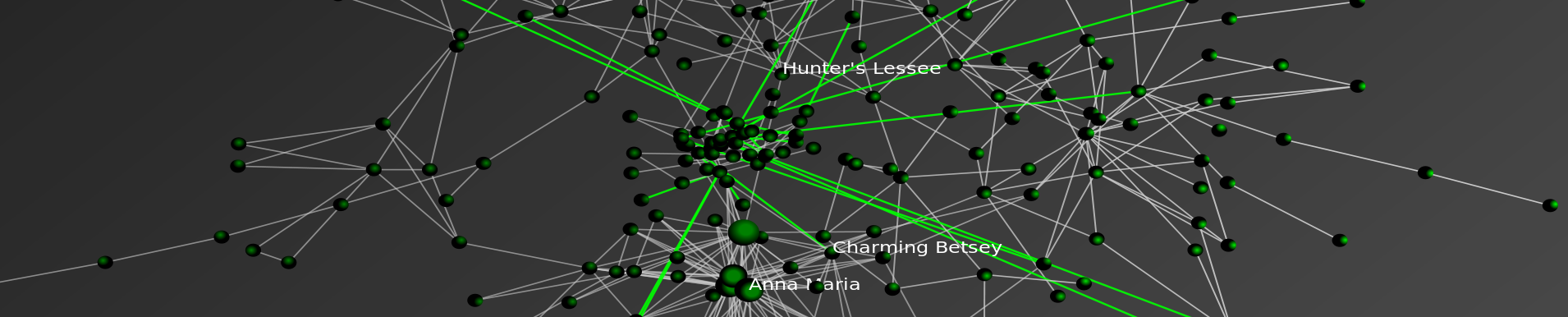
This is a really great visualization. In just one poster, the authors convey a tremendous amount of relevant information to the end user. I would highly recommend acquiring this visualization for any SCOTUS fan on your holiday list!
Acceleration: There were four failures in the first six months of 2008, followed by another 22 failures in the next six months. By January of 2009, there were 21 failures in the first three months of the year, followed by 138 from April to last Friday.
Magnitude: Failures in the past two years have cost the Depositors Insurance Fund an estimated $57B. The IndyMac failure of July 2008 accounted for $10B alone, followed by BankUnited at $4.9B and Guaranty Banks at $3B.
Spatial Correlation: There is a significant amount of spatial correlation in California, Georgia, Florida, Texas, and Illinois. These states account for 77% of the total costs to the Depositors Insurance Fund. Furthermore, most of the losses in California and Georgia were concentrated highly around a few urban centers.
The Movie
The movie below shows the location of bank failures, beginning in 2008 and concluding with the three failed banks from Friday, December 11, 2009. Each green circle corresponds to a bank failure, and the size of each circle corresponds logarithmically to the FDIC’s estimated cost for the Depository Insurance Fund, as stated in the FDIC press releases. For failures with joint press releases, such as the 9 banks that failed on October 30th, the circles are sized in proportion to their relative total deposits.
Our visualization is similar to this one offered by the Wall Street Journal. For sizing the circles, the WSJ relied upon the value of assets at the time of failure. By contrast, our approach focuses upon the estimated impact to the Depositors Insurance Fund (DIF). In several instances, this alternative approach leads to a different qualitative result than the WSJ. For example, consider the case of Washington Mutual. While many have characterized Washington Mutual’s failure as the largest in history, according to the FDIC press release the failure did not actually lead to a draw upon Depositors Insurance Fund. By contrast, the FDIC estimatedcost for the IndyMac Bank failure was substantial– the latest available estimate sets it at 10.7 billion.
According to information obtained from the Federal Deposit Insurance Corporation (FDIC), there have been a total of 186 bank failures in the United States since 2000. Of these, 159 banks or roughly 85% have occurred in the past two years. The plot below displays the yearly failures since 2000. These 159 failures over the past two years have cost the Depositors Insurance Fund an estimated $57B.
In addition to the increase in the rate of bank failures, there has also been a substantial amount of spatial correlation between these failures. The table below shows the five states with the highest estimated total costs to the Depositors Insurance Fund since 2008. Together, these five states account for $44B of the total $57B in the past two years.
(1)China Passes Japan — This dynamic visual demonstrates how in the fall of 2008 China surpassed Japan as the top foreign holder of U.S. Debt.
(2)The Rise of Russia— Notice how Russia becomes a significant holder of U.S. Debt between late-2006 and mid-2007.
(3)The Increasing Amount of U.S. Debt Held Abroad — The pie chart is sized by the total debt held by the current top ten debt holders. As a function of U.S. expenditures over the relevant time period, this pie grows in nearly every time period. In the bottom right corner, we track the total debts held by the current top debt holders. Of course, this alone does not represent the complete picture as there is additional U.S. debt held by a variety of other other countries. Therefore, we also track the grand total of all debts held abroad in the bottom right corner of the visual.
Dynamic Perspective on the Increasing Amount of American Debt Held Abroad
Focusing upon the “Major Foreign Holders of Treasury Securities,” we were interested in considering how today’s major debt holders acquired their top position. The data used the generate the visual above is drawn from United States Department of Treasury. For those interested in replicating our results, the current data is located hereand the historical data is located here.
Some Background on the Car Allowance Rebate System (CARS)
From the official July 27, 2009press release – “The National Highway Traffic Safety Administration (NHTSA) also released the final eligibility requirements to participate in the program. Under the CARS program, consumers receive a $3,500 or $4,500 discount from a car dealer when they trade in their old vehicle and purchase or lease a new, qualifying vehicle. In order to be eligible for the program, the trade-in passenger vehicle must: be manufactured less than 25 years before the date it is traded in; have a combined city/highway fuel economy of 18 miles per gallon or less; be in drivable condition; and be continuously insured and registered to the same owner for the full year before the trade-in. Transactions must be made between now [July 27, 2009] and November 1, 2009 or until the money runs out.”
On August 6, 2009, Congress extended the program adding $2 billion dollars to the program’s initial allocation. For those interested in background, feel free to read the CNN report on the program extension.
On August 13, 2009, the Secretary offered this press release noting “[T]he Department of Transportation today clarified that consumers who want to purchase new vehicles not yet on dealer lots can still be eligible for the CARS program. Dealers and consumers who have reached a valid purchase and sale agreement on a vehicle already in the production pipeline will be able to work with the manufacturer to receive the documentation needed to qualify for the program.”
On August 20, 2009, the Secretary announced the program would end on August 24, 2009at 8pm EST. While this remained the deadline for sales, dealers were provided a small extension to file paperwork ( Noon on August 25, 2009). For those interested, all other press releases are available here.
The Cars.gov DataSet
The full data set is available for download here. From the Cars.gov website “these reports contain the transaction level information entered by participating dealers for the 677,081 CARS transactions that were paid or approved for payment as of Friday, October 16, 2009 at 3:00PM EDT for a total of $2,850,162,500. Please note that confidential financial or commercial information and consumer information protected under the DOT privacy policy has been redacted.” The official cars.gov website offers additional caveats on its note to analysts. One important thing to note, there is a statutory exemption which allowed transactions to occur pursuant to an amended rule after the August 24, 2009 termination date. Here is the relevant language of the amended rule:
“To qualify for the exception process, a dealer must have been prevented from submitting an application for reimbursement due to a hardship caused by the agency. Specifically, a dealer may request an exception if the dealer was locked out of the CARS system, contacted NHTSA for a password reset prior to the announced deadline, but did not receive a password reset. A dealer also may request an exception if its timely transaction was rejected by the CARS system due to a duplicate State identification number, trade-in vehicle VIN, or new vehicle VIN that was never used for a submitted CARS transaction, if the dealer contacted NHTSA prior to the announced deadline to resolve the issue but did not receive a resolution. Finally, a dealer may seek an exception if it was prevented from submitting a transaction by the announced deadline due to another hardship attributable to NHTSA’s action or inaction, upon submission of proof and justification satisfactory to the Administrator.”
For those who have downloaded the full set, the above passage explains why there exist transaction data which fall outside of the general CARS program window.
Dynamic Visualization of the Spatial Distribution of Sales
Each time step of the animation represents a day for which there exists data in the CARS official dataset. While the program officially started on July 27, 2009, the dataset contains both transactions undertaken during the pilot program as well as transactions undertaken pursuant the exemption process described above. Thus, the movie begins with the first unit of observation on July 1, 2009 and terminates with the final transaction on October 24, 2009. Similar to a flip book, the movie is generated by threading together each daily time slice.
The Size and Color of Each Circle
Each circle represents a zip code in which one or more participating dealerships is located. The radius of a given circle is function of the number of CARS related sales in a given zip code as of the date in question. In each day, the circle is colored if there is at least one sale in the current period while the circle is resized based upon the number of sales in the given period.
In the later days of the data window, particular those after official August 25 termination of the program, the daily sales are fairly negligible. However, as outlined in the dataset description above, each participating institution who qualified for the exemption was allowed to submit transactions beyond official program termination date. Notice the cumulative percentage of sales reach nearly all total sales by August 25th. Virtually all sales occur during the official July 27, 2009 – August 24, 2009 window. Thus, while these the stragglers caused certain circles to remain illuminated the size of circles is essentially fixed after August 24, 2009.
Some Things to Notice in the Visualization
In the lower left corner of the video, you will notice two charts. The chart on the left tracks the contribution to total sales for the given day. The chart on the right represent the cumulative percentage of sales to date under the program. Not surprisingly, most of the transactions under the CARS program take place between July 27, 2009 – August 24, 2009 time window.
Within this window, the daily sales feature a variety of interesting trends. During each Sunday of the program (i.e.August 2nd, August 9th, August 16th & August 23rd) sales were significantly diminished. Not surprisingly, the end of week and early weekend sales tend to be the strongest.
In the very early days of the program, there were a variety of media reports (e.g.here, here, here) highlighting the quickly dimishing resources under the program. Obviously, it is difficult to determine the underlying demand for the program. However, given the extent of the acceleration, it appears these reports contributed to the rapid depletion of the initial 1 billion dollars allocated under the program. A similar but less pronounced form of herding also accompanied the last days of the CARS program.
Mike and I just spent a couple days a Washington University’s Center for Empirical Research in the Law for a meeting related to the Supreme Court Open Infrastructure Project. The meeting featured a number of great folks with cool data projects. The discussion was very fruitful and it is clear that the end product is going to offer a wide range of data relevant resources. We are looking forward to contribute to the project in the months to come!
Full Story over at Think Progress. Our original post on the length of HR 3962 is here. The subsequent NY Times Article on the Length of HR 3962 is here. Enjoy!
Click on this icon to view the Movie in Full Screen Mode!
STATIC SNAPSHOT TO DYNAMIC ANIMATION
In our prior post analyzing the email database of Climate Research Unitat the University of East Anglia, we aggregated all emails over the relevant 1997-2009 time period into a single static visualization. Specifically, to build the network, we processed every email in the leaked data. Each email contains a sender and at least one recipient on the To:, Cc:, or Bcc: line.
One obvious shortcoming associated with producing a static snapshot for data set, is that it often obscures the time evolving dynamics of interaction which produced the full graph. To generate a dynamic picture, it is necessary to collect time stamped network data. In the current case, this required acquisition of the date field for each of the emails. With this information, we used the same underlying data to generate a dynamic network animation for the 1997-2009 time window.
HOW TO INTERPET THE MOVIE
Consistent with the approach offered in our prior visualization, each node represents an individual within the email dataset while each connection reflects the weighted relationship between those individuals. The movie posted above features the date in the upper left. As time ticks forward, you will notice that the relative social relationships between individuals are updated with each new batch of emails. In some periods, this updating has significant impact upon the broader network topology and at other time it imposes little structural consequences.
In each period, both new connections as well as new communications across existing connections are colored teal while the existing and dormant relationships remain white. Among other things, this is useful because it identifies when a connection is established and which interactions are active at any given time period.
A SHORT VERSION AND A LONG VERSION
We have two separate versions of the movie. The version above is a shorter version where roughly 13 years is displayed in under 2 minutes. In the coming days, we will have a longer version of the movie which ticks a one email at a time. In both versions, each frame is rendered using the Kamada-Kawailayout algorithm. Then, the frames are threaded together using linear interpolation.
SELECTION EFFECTS
Issues of selection of confront many researchers. Namely, given the released emails are only a subset of the broader universe of emails authored over the relevant time window, it is important to remember that the data has been filtered and the impact of this filtration can not be precisely determined. Notwithstanding this issue, our assumption is that every email from a sender to a recipient represents a some level of relationship between them. Furthermore, we assume that more emails sent between two people generally indicates a stronger relationship between those individuals.
DIMENSIONALITY
In our academic scholarship, we have confronted questions of dimensionality in network data. Simply put, analyzing network data drawn from high dimensional space can be really thorny. In the current context, a given email box likely contains emails on lots of subjects and reflects lots of people not relevant to the specific issue in question. Again, while we do not specifically know the manner in which the filter was applied, it is certainly possible that the filter actually served to mitigate issues of dimensionality.
 Drew Conway over at Zero Intelligence Agents brought to our attention the Farouk1986 data set provided by Evan Kohlman from the NEFA Foundation. For those not familiar, Umar Farouk Abdulmutallab, who is charged with willful attempt to destroy an aircraft in connection with the Christmas Day Flight 253 from Amsterdam to Detroit, made a number of posts to the Islamic Forum Gawaher.com using the handle “Farouk1986.”


