As reported in a wide variety of news outlets, last week, a large amount of data was hacked from the Climate Research Unit at the University of East Anglia. This data included both source code for the CRU climate models, as well as emails from the individuals involved with the group. For those interested in background information, you can read the NY Times coverage here and here. Read the Wall Street Journal here. Read the Telegraph here. For those interested in searching the emails, the NY Times directs the end user to http://www.eastangliaemails.com/.
Given the data is widely available on the internet, we thought it would be interesting to analyze the network of contacts found within these leaked emails. Similar analysis has been offered for large datasets such as the famous Enron email data set. While there may be some selection issues associated with observing this subset of existing emails, we believe this network still gives us a “proxy” into the structure of communication and power in an important group of researchers (both at the individual and organization level).
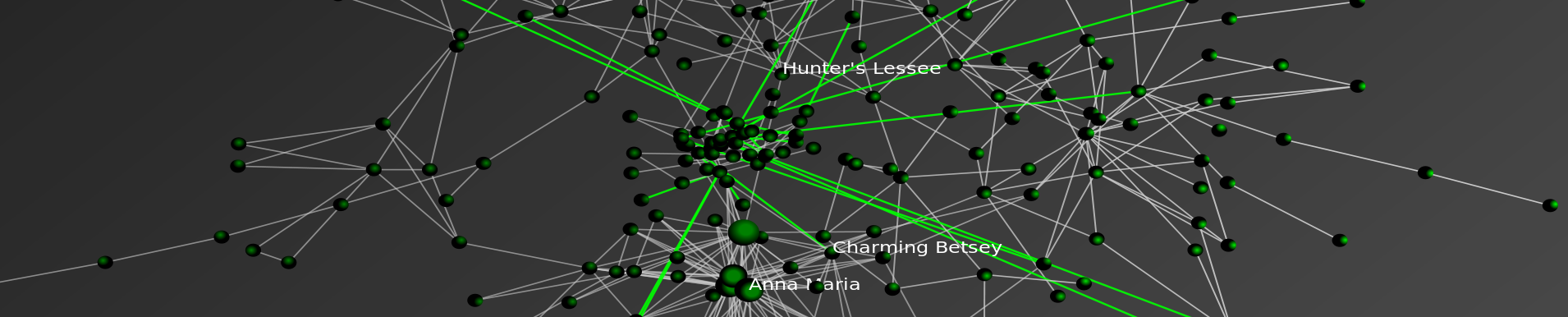
To build this network, we processed every email in the leaked data. Each email contains a sender and at least one recipient on the To:, Cc:, or Bcc: line. The key assumption is that every email from a sender to a recipient represents a relationship between them. Furthermore, we assume that more emails sent between two people, as a general proposition indicates a stronger relationship between individuals.
To visualize the network, we draw a blue circle for every email address in the data set. The size of the blue circle represents how many emails they sent or received in the data set – bigger nodes thus sent or received a disproportionate number of emails. Next, we draw grey lines between these circles to represent that emails were sent between the two contacts. These lines are also sized by the number of emails sent between the two nodes.
Typically, we would also provide full labels for nodes in a network. However, we decided to engage in partial “anonymization” for the email addresses of those in the data set. Thus, we have removed all information before the @ sign. For instance, an email such as johndoe@umich.edu is shown as umich.edu in the visual. If you would like to view this network without this partial “anonymization,” it is of course possible to download the data and run the source code provided below.
Note: We have updated the image. Specifically, we substituted a grey background for the full black background in an effort to make the visual easier to read/interpret.
Click here for a zoomable version of the visual on Microsoft Seadragon.

Don’t forget to use SeaDragon’s fullscreen option:

Hubs and Authorities:
In addition to the visual, we provide hub and authority scores for the nodes in the network. We provide names for these nodes but do not provide their email address.
Authority
- Phil Jones: 1.0
- Keith Briffa: 0.86
- Tim Osborn: 0.80
- Jonathan Overpeck: 0.57
- Tom Wigley: 0.54
- Gavin Schmidt: 0.54
- Raymond Bradley: 0.52
- Kevin Trenberth: 0.49
- Benjamin Santer: 0.49
- Michael Mann: 0.46
Hubs returns nearly identical ranks with slightly perturbed orders with the notable exception that the UK Met Office IPCC Working Group has the highest hub score.
Thus, so far as these emails are a reasonable “proxy” for the true structure of this communication network, these are some of the most important individuals in the network.
Source Code:
Unlike some existing CRU code, the code below is documented, handles errors, and is freely available.
One thought on “Visualizing the East Anglia Climate Research Unit Leaked Email Network”
Comments are closed.