
Month: November 2009
Well Formed Eigenfactor.Org–Wonderful Visualization of CrossDisciplinary Fertilization, Information Flow & The Structure of Science [Repost]

Given our interest in both interdisciplinary scholarship and the spread of ideas, we wanted to highlight one of our favorite projects–eigenfactor.org. Here is basic documentation from their website. There are also links to academic papers offering far more detailed documentation for the data and algorithm choice. In particular, read Martin Rosvall and Carl T. Bergstrom, Maps of Random Walks on Complex Networks, Proc. of the Nat. Academy of Sci. 105:1118-1123 (2007). The above visualizations are written in Flare by Moritz Stefaner. Click on the slide above to reach these interactive visualizations. These mapping offer reveal the reach of various publications across disciplines–some are insular and others have incredible reach. The inner rings are journals and the outer rings are the host disciplines. Enjoy!
Visualizing the East Anglia Climate Research Unit Leaked Email Network
As reported in a wide variety of news outlets, last week, a large amount of data was hacked from the Climate Research Unit at the University of East Anglia. This data included both source code for the CRU climate models, as well as emails from the individuals involved with the group. For those interested in background information, you can read the NY Times coverage here and here. Read the Wall Street Journal here. Read the Telegraph here. For those interested in searching the emails, the NY Times directs the end user to http://www.eastangliaemails.com/.
Given the data is widely available on the internet, we thought it would be interesting to analyze the network of contacts found within these leaked emails. Similar analysis has been offered for large datasets such as the famous Enron email data set. While there may be some selection issues associated with observing this subset of existing emails, we believe this network still gives us a “proxy” into the structure of communication and power in an important group of researchers (both at the individual and organization level).
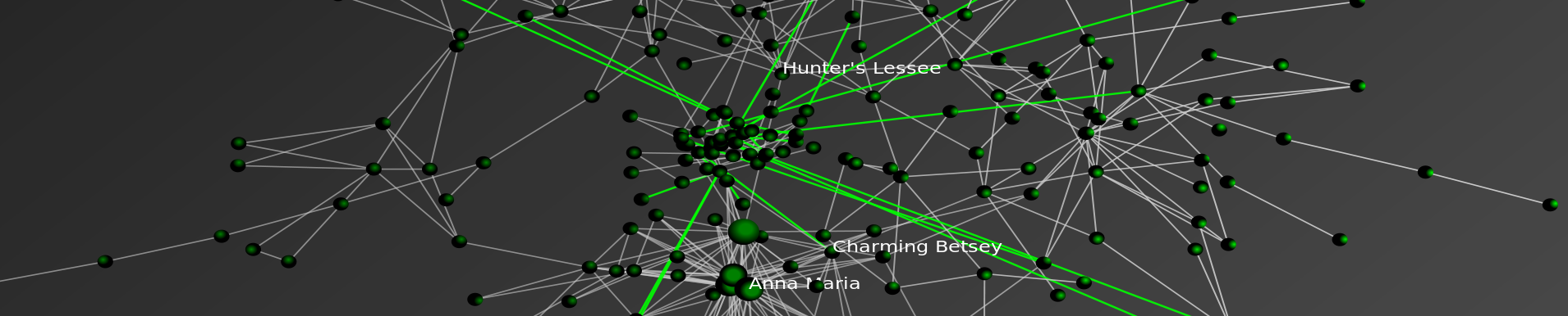
To build this network, we processed every email in the leaked data. Each email contains a sender and at least one recipient on the To:, Cc:, or Bcc: line. The key assumption is that every email from a sender to a recipient represents a relationship between them. Furthermore, we assume that more emails sent between two people, as a general proposition indicates a stronger relationship between individuals.
To visualize the network, we draw a blue circle for every email address in the data set. The size of the blue circle represents how many emails they sent or received in the data set – bigger nodes thus sent or received a disproportionate number of emails. Next, we draw grey lines between these circles to represent that emails were sent between the two contacts. These lines are also sized by the number of emails sent between the two nodes.
Typically, we would also provide full labels for nodes in a network. However, we decided to engage in partial “anonymization” for the email addresses of those in the data set. Thus, we have removed all information before the @ sign. For instance, an email such as johndoe@umich.edu is shown as umich.edu in the visual. If you would like to view this network without this partial “anonymization,” it is of course possible to download the data and run the source code provided below.
Note: We have updated the image. Specifically, we substituted a grey background for the full black background in an effort to make the visual easier to read/interpret.
Click here for a zoomable version of the visual on Microsoft Seadragon.

Don’t forget to use SeaDragon’s fullscreen option:

Hubs and Authorities:
In addition to the visual, we provide hub and authority scores for the nodes in the network. We provide names for these nodes but do not provide their email address.
Authority
- Phil Jones: 1.0
- Keith Briffa: 0.86
- Tim Osborn: 0.80
- Jonathan Overpeck: 0.57
- Tom Wigley: 0.54
- Gavin Schmidt: 0.54
- Raymond Bradley: 0.52
- Kevin Trenberth: 0.49
- Benjamin Santer: 0.49
- Michael Mann: 0.46
Hubs returns nearly identical ranks with slightly perturbed orders with the notable exception that the UK Met Office IPCC Working Group has the highest hub score.
Thus, so far as these emails are a reasonable “proxy” for the true structure of this communication network, these are some of the most important individuals in the network.
Source Code:
Unlike some existing CRU code, the code below is documented, handles errors, and is freely available.
Happy Thanksgiving!
More Posts Forthcoming Soon ….
Google Wave — A Promising Platform for Real-Time Collaboration

Also from the good folks at Google Scholar comes caselaw and patents together with metadata, page tags and a nice “how cited” feature. Here is the announcement from the GoogleBlog. Useful analysis available at Legal Informatics Blog, Just in Case and Internet for Lawyers. Enjoy!
Visualizing the Linkage Structure of the Law Blogosphere

So this is Version 1.0 of our series regarding the linkage structure of the Law Blogosphere. We are currently working on a Version 2.0 that will feature documentation and a larger set of law blogs. Check back soon for more!
“Sink Method” Poster for Conference on Empirical Legal Studies (CELS 2009 @ USC)

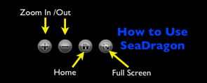
As we mentioned in previous posts, Seadragon is a really cool product. Please note load times may vary depending upon your specific machine configuration as well as the strength of your internet connection. For those not familiar with how to operate it please see below. In our view, the Full Screen is best the way to go ….
Conference on Empirical Legal Studies @ USC Law School

Mike and I are in route to the 2009 Conference on Empirical Legal Studies (CELS) at USC Law School. This post is actually coming to you from 32,000 feet on GoGo Wireless. I still cannot get over the idea of being on wireless from a moving airplane. We live in extraordinary times!
Law Professoriate Poster for Conference on Empirical Legal Studies (CELS 2009 @ USC)

 As we mentioned in previous posts, Seadragon is a really cool product. Please note load times may vary depending upon your specific machine configuration as well as the strength of your internet connection. For those not familiar with how to operate it please see below. In our view, the Full Screen is best the way to go ….

Statistical Time Machines

So, I was a bit late on this … However, it is a really cool idea and thus I want to flag it for those who might have missed it. As covered over at SCOTUS Blog and ELS Blog, the November 12th Wall Street Journal features a story entitled “Statistical Time Travel Helps to Answer What-Ifs.” Of interest to legal scholars, Professors Andrew Martin and Kevin Quinn discuss a series of what-ifs including how today’s Supreme Court would have voted on Roe v. Wade … Check it out!
Programming Dynamic Models in Python-Part 3: Outbreak on a Network
In this post, we will continue building on the basic models we discussed in the first and second tutorials. If you haven’t had a chance to take a look at them yet, definitely go back and at least skim them, since the ideas and code there form the backbone of what we’ll be doing here.
In this tutorial, we will build a model that can simulate outbreaks of disease on a small-world network (although the code can support arbitrary networks). This tutorial represents a shift away from both:
a) the mass-action mixing of the first two and and
b) the assumption of social homogeneity across individuals that allowed us to take some shortcuts to simplify model code and speed execution. Put another way, we’re moving more in the direction of individual-based modeling.
When we’re done, your model should be producing plots that look like this:

Red nodes are individuals who have been infected before the end of the run, blue nodes are never-infected individuals and green ones are the index cases who are infectious at the beginning of the run.
And your model will be putting out interesting and unpredictable results such as these:

In order to do this one, though, you’re going to need to download and install have igraph for Python on your system.
Individual-Based Networks
It is important to make the subtle distinction between individual and agent based models very clear here. Although the terms are often used interchangeably, referring to our nodes, who have no agency, per se, but are instead fairly static receivers and diffusers of infection, as agents, seems like overreaching. Were they to exhibit some kind of adaptive behavior, i.e., avoiding infectious agents or removing themselves from the population during the infective period, they then become more agent-like.
This is not to under- or over-emphasize the importance or utility of either approach, but just to keep the distinction in mind to avoid the “when all you have is a hammer, everything looks like a nail” problem.
In short, adaptive agents are great, but they’re overkill if you don’t need them for your specific problem.
Small World Networks
The guiding idea behind small-world networks is that they capture some of the structure seen in more realistic contact networks: most contacts are regular in the sense that they are fairly predicable, but there are some contacts that span tightly clustered social groups and bring them together.
In the basic small-world model, an individual is connected to some (small, typically <=8) number of his or her immediate neighbors. Some fraction of these network connections are then randomly re-wired, so that some individuals who were previously distant in network terms – i.e., connected by a large number of jumps – are now adjacent to each other. This also has the effect of shortening the distance between their neighbors and individuals on the other side of the graph. Another way of putting this is that we have shortened the average path length and increased the average reachability of all nodes.
These random connections are sometimes referred to as “weak ties”, as there are fewer of these ties that bridge clusters than there are within clusters. When these networks are considered from a sociological perspective, we often expect to find that the relationship represented by a weak tie is one in which the actors on either end have less in common with each other than they do with their ‘closer’ network neighbors.
Random networks also have the property of having short average path lengths, but they lack the clustering that gives the small-world model that pleasant smell of quasi-realism that makes them an interesting but largely tractable, testing ground for theories about the impact of social structure on dynamic processes.
Installation and Implementation Issues
If you have all the pre-requisites installed on your system, you should be able to just copy and paste this code into a new file and run it with your friendly, local Python interpreter. When you run the model, you should first see a plot of the network, and when you close this, you should see a plot of the number of infections as a function of time shortly thereafter.
Aside from the addition of the network, the major conceptual difference is that the model operates on discrete individuals instead of a homogeneous population of agents. In this case, the only heterogeneity is in the number and identity of each individual’s contacts, but there’s no reason we can’t (and many do) incorporate more heterogeneity (biological, etc.) into a very similar model framework.
With Python, this change in orientation to homogeneous nodes to discrete individuals seems almost trivial, but in other languages it can be somewhat painful. For instance, in C/++, a similar implementation would involve defining a struct with fields for recovery time and individual ID, and defining a custom comparison operator for these structs. Although this is admittedly not a super-high bar to pass, it adds enough complexity that it can scare off novices and frustrate more experienced modelers.
Perhaps more importantly, it often has the effect of convincing programmers that a more heavily object-oriented approach is the way to go, so that each individual is a discrete object. When our individuals are as inert as they are in this model, this ends up being a waste of resources and makes for significantly more cluttered code. The end result can often be a model written in a language that is ostensibly faster than Python, such as C++ or Java, that runs slower than a saner (and more readable) Python implementation.
For those of you who are playing along at home, here are some things to think about and try with this model:
- Change the kind of network topology the model uses (you can find all of the different networks available in igraph here).
- Incorporate another level of agent heterogeneity: Allow agents to have differing levels of infectivity (Easier); Give agents different recovery time distributions (Harder, but not super difficult).
- Make two network models – you can think of them as separate towns – and allow them to weakly influence each other’s outbreaks. (Try to use the object-oriented framework here with minimal changes to the basic model.)
That’s it for tutorial #3, (other than reviewing the comment code which is below) but definitely check back for more on network models!
In future posts, we’ll be thinking about more dynamic networks (i.e., ones where the links can change over time), agents with a little more agency, and tools for generating dynamic visualizations (i.e., movies!) of stochastic processes on networks.
That really covers the bulk of the major conceptual issues. Now let’s work through the implementation.
Click Below to Review the Implementation and Commented Code!
Continue reading “Programming Dynamic Models in Python-Part 3: Outbreak on a Network”
New Paper: Properties of the United States Code Citation Network
We have been working on a larger paper applying many concepts from structural analysis and complexity science to the study of bodies of statutory law such as the United States Code. To preview the broader paper, we’ve published to SSRN and arXiv a shorter, more technical analysis of the properties of the United States Code’s network of citations.
Click here to Download the Paper!
Abstract: The United States Code is a body of documents that collectively comprises the statutory law of the United States. In this short paper, we investigate the properties of the network of citations contained within the Code, most notably its degree distribution. Acknowledging the text contained within each of the Code’s section nodes, we adjust our interpretation of the nodes to control for section length. Though we find a number of interesting properties in these degree distributions, the power law distribution is not an appropriate model for this system.

- Citation In-Degree
Katz & Bommarito in the New York Times Discussing H.R. 3962

If you click through on the link above you will be directed to the New York Times Rx Blog. The full version of the article appears online while a shorter version appeared in today’s print edition. For those viewing the print edition, the story is located on page A20. This website is mentioned in both versions of the story!
Visualizing the Structure of H.R. 3962 — The Health Care Bill

In addition to the facts we have presented on HR 3962, we wanted to offer a visualization for the structure of the Bill. Like many other bills, HR 3962, is divided into Divisions, Titles, Subtitles, Parts, Subparts, Sections, Subsections, Clauses, and Subclauses. These hierarchical splits represent the drafters’ conception of its organization, and thus the relative size of these categories may provide an indication of both the importance of each section of the Bill as well as the overall size of the document. By clicking through the image below, you can navigate a zoomable representation of the structure of HR 3962 using Microsoft’s Seadragon zoom interface. Many of the Divisions, Titles, Subtitles, Parts, and Subparts of the Bill are labeled. The balance are not labeled because they fell on an angle on the radial layout which rendered them impossible to read.
The graph is laid out in a radial manner with the center node labeled “H.R. 3962.” Legislation, the broader United States Code as well as many other classes of information are organized as hierarchical documents. H.R. 3962 is no different. For those less familiar with this type of documents, we thought it useful to provide a tutorial regarding (1) how to use this zoomable visualization (2) the correspondence between the visual and the Library of Congress version of H.R. 3962
How Do I Open/Navigate the Visualization?
(1) Open the Library of Congress version of H.R. 3962 in another browser window.
(2) Open the visualization by clicking on the large image above.
(3) Clicking on the image above will take you to the Seadragon platform. (Note: Load times will vary from machine to machine… so please be patient.)
(4) Seadragon allows for zoomable visualizations and for full screen viewing. Full screen is really the best way to go. If you run your mouse over the black box where the visual is located you will see four buttons in the southeast corner. The “full screen” button is the last one on the right. Click the button and you will be taken to full screen viewing!
(5) Click to zoom in and out, hold the mouse down and drag the entire visual, etc. Now, you are ready to traverse the graph using this visualization as your very own “H.R. 3962 Magic Decoder Wheel.”
How Do I Understand the Visualization?
To introduce the substance of the visualization, we have color coded two separate examples right into the visualization.
Example 1: Bills such as HR 3962 often feature a “short title” provision at the very begining of the legislation. For example, if you download the PDF copy of the bill, you can see the short title at the bottom of page 1 of the bill. You can also see this in the Library of Congress version of H.R. 3962.
SECTION 1. SHORT TITLE; TABLE OF DIVISIONS, TITLES, AND SUBTITLES.
(a) Short Title- This Act may be cited as the `Affordable Health Care for America Act’.
Zoom in close to start in the center where the large node labeled “HR 3962.” Notice the blue colorized path features the blue labels 1. and terminates with the label (a). The labels in the graph are the labels in the text above. While this is a simple example, the precise logic defines the entire graph.
Example 2: This is a bit more difficult as it requires the traversal of several provisions in order to reach a terminal node. In this case, the terminal node read as follows … “SEC. 401. INDIVIDUAL RESPONSIBILITY.For an individual’s responsibility to obtain acceptable coverage, see section 59B of the Internal Revenue Code of 1986 (as added by section 501 of this Act).”
DIVISION A–AFFORDABLE HEALTH CARE CHOICES
TITLE IV–SHARED RESPONSIBILITY
Subtitle A–Individual Responsibility
SEC. 401. INDIVIDUAL RESPONSIBILITY.
Again, zoom in close to start in the center--where the large node labeled “HR 3962.” Notice the blue colorized path features the blue labels A and terminates with the label 401. In between the start and finish, there are stops at IV and A, respectfully. Just as before, the labels in the graph are the labels in the text above. The end user can follow the precise journey but without the visual by using the Library of Congress version of H.R. 3962.