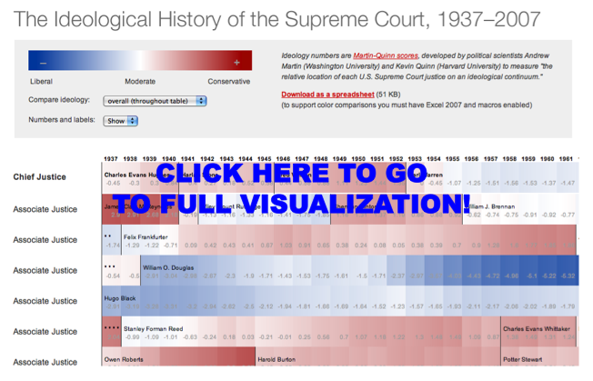
Here is a cool visual for the Martin-Quinn Scores. For those of you not familiar, the Martin-Quinn paper and “MQ Scores” represented a significant breakthrough in the field of judicial politics. On that note, Stephen Jessee & Alexander Tahk have done a nice job both bringing their data up to date and extending their work. For those interested, click on the visual above and check out all of the relevant links contained within this post.
Tag: visualization
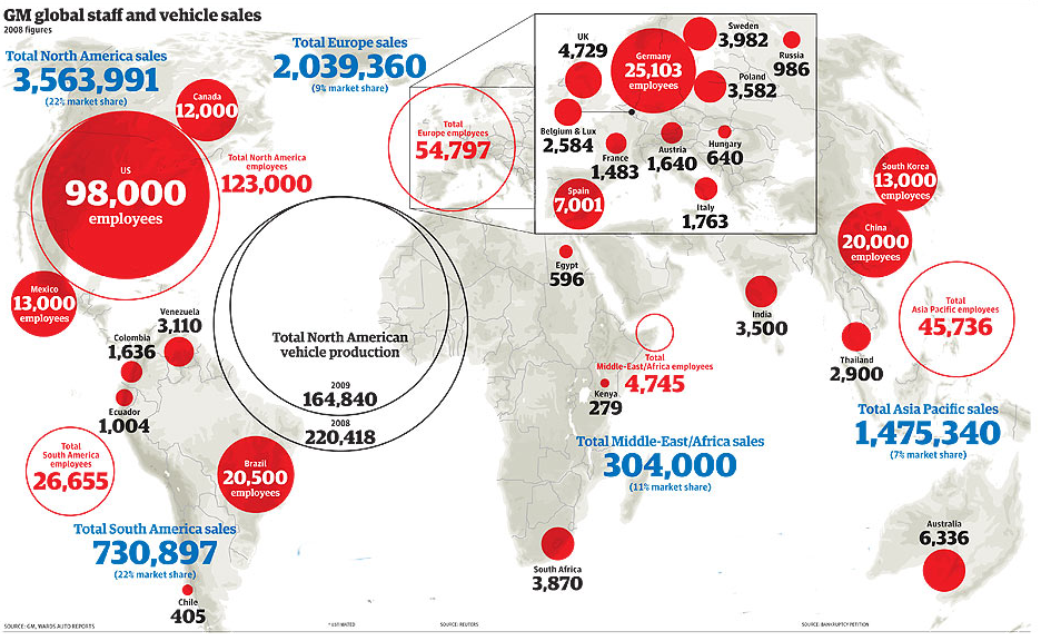
The General Motors Corp. [From the Guardian]
On this tough day here in Michigan … here is the visualization from the Guardian. Bracketing poor performance in the domestic market, there are some bright spots here in the company’s worldwide sales.
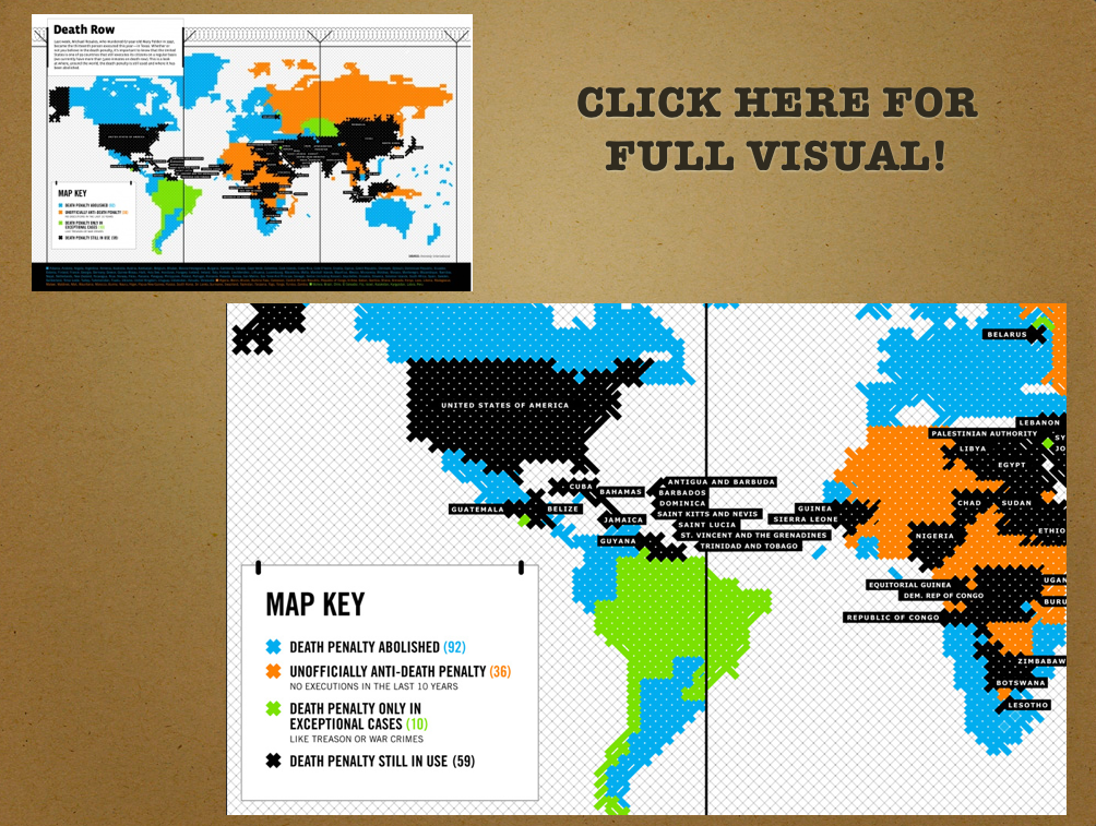
Death Penalty Around the World — (From Flowing Data)
Blogging is going to be light from here through Memorial Day …. but we will back to a more typical posting cycle in late May. In the meantime, we thought we would briefly highlight an interesting visual we saw over at Flowing Data. This visual produced by Good Magazine maps the use of the death penalty across various countries.
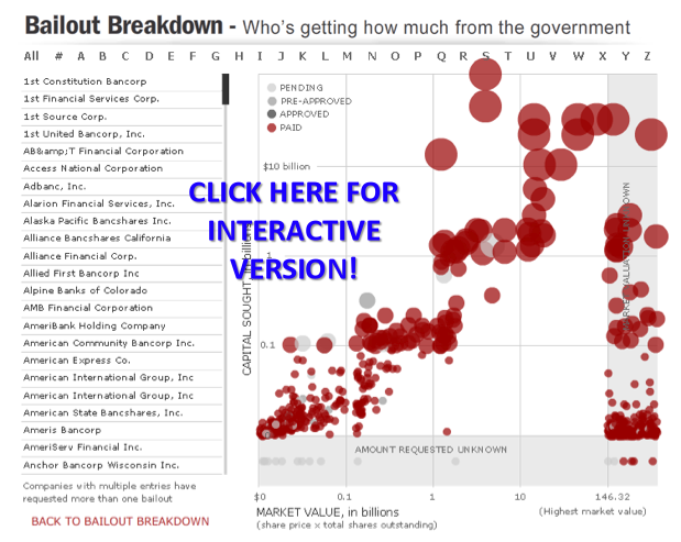
The Bailout Breakdown from the Associated Press
Datavisualization.ch/ recently highlighted this interactive “Bailout Breakdown” offered by the Associated Press….. “Bailout Breakdown from Associated Press is an interactive applet that lets the user analyze the recipients and amounts of the $700 Billion bailout plan from the American government. The data is presented as a scatterplot with additional information about the representations when the hovers over a plotted item. The markers are color coded to distinguish between pending, pre-approved, approved and paid status.” At the end of his post, Benjamin Wiederkehr offers some principled critiques of the visualization techniques employed by the authors. Notwithstanding, we still thought it was still worthy of highlighting.
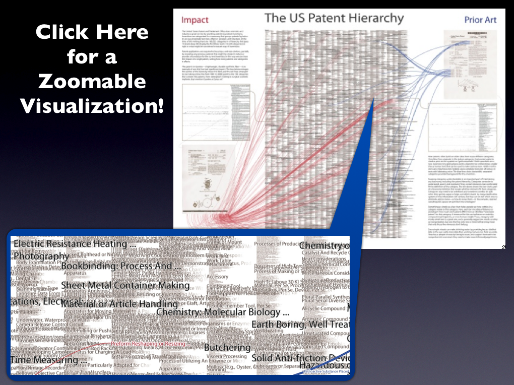
Classifying the US Patent Hierarchy
The United States Patent and Trademark Office patent classification scheme organizes 3 million patents into about 160,000 distinct patent classes. This visualization by Katy Börner, Elisha Hardy, Bruce W. Herr II, Todd M. Holloway, & W. Bradford Paley considers the organizational schema used to classify patents at the US Patent Office. Their article Taxonomy Visualization in Support of the Semi-Automatic Validation and Optimization of Organizational Schemas was published in the Journal of Informetrics in 2007.
From the Abstract: “The taxonomy visualization and validation (TV) tool introduced in this paper supports the semi-automatic validation and optimization of organizational schemas such as file directories, classification hierarchies, taxonomies, or other structures imposed on a data set for organization, access, and naming. By showing the “goodness of fit” for a schema and the potentially millions of entities it organizes, the TV tool eases the identification and reclassification of misclassified information entities, the identification of classes that grow too large, the evaluation of the size and homogeneity of existing classes, the examination of the “well-formedness” of an organizational schema, and more.”
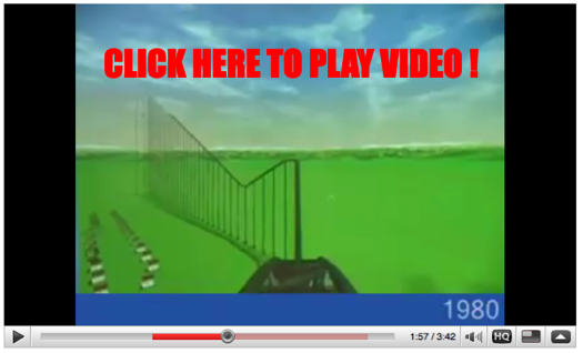
The Real Estate Roller Coaster — Visualizing the Speculative Bubble
We are working hard to produce more original content for the site. In the meantime, we want to share some of our favorite projects and papers. Many of you have probably seen this visualization of housing prices–including the run up to 2007. For those of you not previously familiar, the authors plotted inflation adjusted US Home Prices (1890-2006) on a roller coaster! Pretty creative stuff….
Visualizing 26 U.S.C ___ : At the “Section Depth”
Title 26 of the United States Code is likely on the mind of many as we move toward April 15th. As a part of a project with Lilian V. Faulhaber (Climenko Fellow from HLS), we have become interested in the architecture of 26 U.S.C. ___.
As we define it, a “section depth” representation for 26 U.S.C. 501(c)(3) represents a traversal to the level of Sec. 501. While a “full depth” representation would include a mapping beyond Sec. 501 to its (c) and (3) subcomponents. In our previous post highlighting 11 U.S.C. __ (the Bankruptcy Code), we presented a traversable “full depth” representation for its structure.
Considering all 50 titles of the United States Code, 26 U.S.C. __ is among the largest of the titles in its architectural size and depth. In fact, given its size, it is not possible for us to render for public consumption, a labeled, “full depth” and zoomable representation for all of 26 U.S.C. ___.
Above we provide a “section depth” representation for 26 U.S.C __ where the terminal nodes are sections such Sec. 1031. You will notice that this section depth representation is roughly the size of the full depth representation we provide for 11 U.S.C. ___. We have colored in Green the primary Income Tax Sections under 26. The documentation is similar to that for 11 U.S.C. ___ thus please refer to this post for additional information. However, for traversal purposes, it is important to remember to start in the middle at the “26 U.S.C.” and follow the branch of the graph out to a leaf node.
We believe the comparative consideration of the architecture for these titles offers a rough first cut on questions of code magnitude and complexity. Although it is a first order approximation and we do believe layering in the relevant administrative regulations and jurisprudence to these sections would represent an improvement on the question, it still bears asking whether it would drastically alter the macro state of affairs. That is an empirical question and only time will tell.
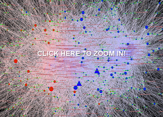
Visualizing Contributions to the 110th Congress — The House Edition
DOCUMENTATION FOR THE VISUALIZATION
University of Michigan
Center for the Study of Complex Systems
Department of Political Science
BASIC OVERVIEW:
110th Congress = January 3, 2007 – January 3, 2009
435 Voting Members of the United States House of Representatives + District of Columbia (Eleanor Holmes Norton) + Puerto Rico (Luis Fortuno) + Virgin Islands (Donna Christian-Green) + American Samoa (Eni F H Faleomavega) + Guam (Madeleine Z Bordallo)
Click here and here for the Senators of the 110th Congress.
BASIC RULE:
Squares (Institutions) Introduce Money into the System and Circles (Congressmen) Receive Money.
DATA OVERVIEW:
Using recently published data on campaign contributions collected by the Federal Election Commission and aggregated by the Center for Responsive Politics our visualizations track large money donations to members of the 110th Congress over the 2007 – 2008 window.
It is important to note that most of these organizations did not directly donate. Rather, as noted by the Center for Responsive Politics “the money came from the organization’s PAC, its individual members or employees or owners, and those individuals’ immediate families. Organization totals include subsidiaries and affiliates. Of course, it is impossible to know either the economic interest that made each individual contribution possible or the motivation for each individual giver. However, the patterns of contributions provide critical information for voters, researchers and others.”
The Center describes its methodology here http://www.opensecrets.org/politicians/method_pop.php.
To provide for an optically tractable view of the top contributions, we follow the CRP and impose the limiting requirement that to be included in our tally a given group’s contribution must fall within a given house members top contributor list.
We try to strike a tradeoff between information overload and incomplete disclosure.
In coming days, we will provide an additional visualization of the underlying data. Check back soon!
CONTRIBUTORS & CONTRIBUTIONS:
2,508 of the Donors are captured in the Graph.
Total Recorded Donations Introduced into our Visualization by these Entities Total to $113,134,698
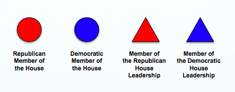
(1) SIZING of the REPRESENTATIVE NODES — Each Circular node representing a Member of the House is sized according the amount of incoming donations. Thus, larger nodes are the recipients of larger sums of money while the smaller nodes received smaller amounts of money.

(2) COLORING and SHAPES of the REPRESENTATIVE NODES — Each node representing a Member of the United States House of Representatives is colored according their Political Party. Using popular convention, we color members of the Republican Party as Red and members of the Democratic Party as Blue.
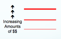
(3) SIZING of the CONNECTIONS — Each Connection (Arc) between an Institution and a Member of the House is sized according to the amount of money flowing through a connection. Darker connections represent larger flows of money while lighter connections represent smaller amounts of money.
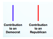
(4) COLORING of the CONNECTIONS — Each connection representing a campaign contribution from an entity to a member of Congress is colored according to partisan affiliation of the receiving representatives. Using popular convention, we color members of the Republican Party as Red and members of the Democratic Party as Blue.
(5) STRUCTURE OF THE GRAPH — The Graph is Visualized Using Fruchterman-Reingold. This is an automated spring embedded, force directed placement algorithm often used in the network science literature to visualize graphs of this size.
(6) ACKNOWLEDGEMENTS — We thank Rick Riolo, Jon Zelner, Carl Simon, Scott Page and the Center for Responsive Politics for their comments, contributions and/or data.
With Bankruptcy on Our Minds: The Structure of Title 11 U.S.C.
CLICK ON IT AND YOU CAN ZOOM IN and READ EVERY LABEL!
MOTIVATION:
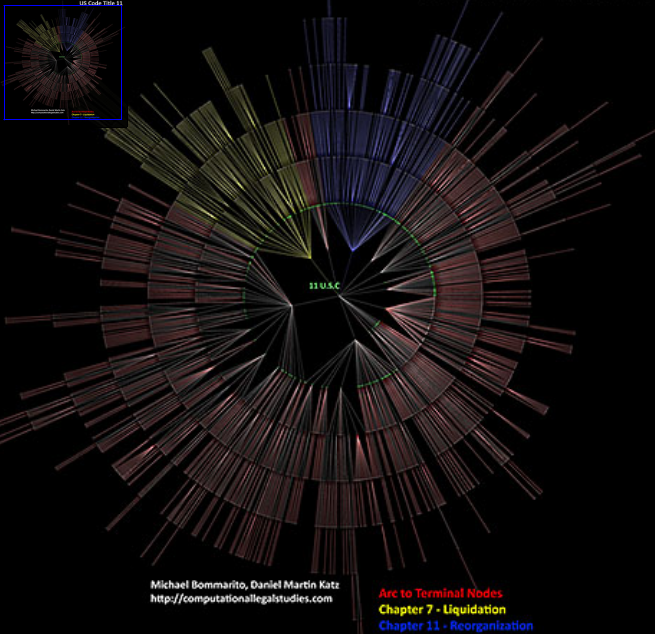
We have become interesting in visualizing the structure of the law including its components and subcomponents. In reduced form, statutes, regulations and certain other units of the law can be characterized in graph theoretical terms. While we do not make deep inroads on the content of this above graph, we do generate a tree traversable visualization for its structure.
Much of my training in law school (particularly in the so called “code-based” classes) was focused upon developing mental models for the structure and content of graphs such as the one displayed above. In my case, I believe the usage of such a visualization early in a code-based course would have been beneficial. Thus, we offer this traversable visualization to the world for not only its research value but also for pedagogical purposes.
INSTRUCTIONS:
Start in the MIDDLE at the “11 U.S.C.__ ” Label and traverse out.
BREAKDOWN OF THE VISUAL:
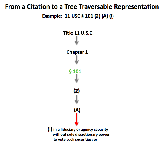
GREEN NODE LABELS = for SECTIONS {In the Example below, 11 U.S.C. § 101}
YELLOW ARCS — Chapter 7 of Title 11 = LIQUIDATION
BLUE ARCS — Chapter 11 of Title 11 = REORGANIZATION (aka “Filing Chapter 11“)
RED ARCS and GREY ARCS — Balance of the Chapters under Title 11
Red Arcs are for lines which lead to terminal nodes
Grey Arcs are for lines which do not immediately lead to terminal nodes
FINAL THOUGHTS:
Please feel free to PLAY AROUND and TEST IT OUT!
This is an early production version so please provide us with any feedback and/or suggestions.

