
Tag: visualization
Visualizing the Gawaher Interactions of Umar Farouk Abdulmutallab, the Christmas Day Bomber
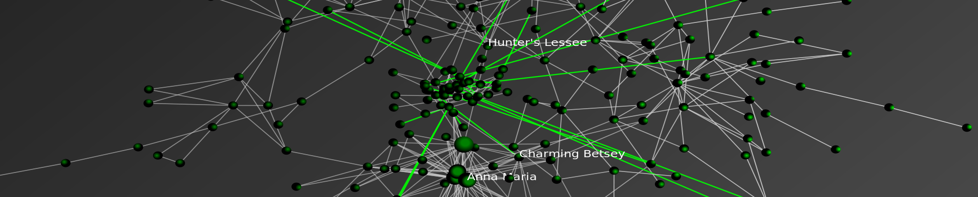
Based on the Farouk1986 Gawaher data posted earlier this week, we have analyzed the communication network of the alleged Christmas Day Bomber, Umar Farouk Abdulmutallab.
Using the handle “Farouk1986,” Abdulmutallab was a regular participant on the Islamic forum Gawaher.com. Several years prior to the Christmas Day incident, the alleged Christmas Day Bomber took part in a significant number of communications. Of course, these communications can be analyzed in a number of ways. For example, over at Zero Intelligence Agents, Drew Conway has already done some useful initial analysis. We sought to contribute our analysis of the time-evolving communication network contained within these posts. While more extensive documentation is available below, in reviewing the dynamic network visualization, consider the following observations:
Click on the Full Screen Button! (4 Arrow Symbol in the Vimeo Bottom Banner)
#1) “Farouk1986” Entered an Existing Network Which Appeared to Increase the Salience of Religion in His Life
Although individuals in society may feel isolated or appear to be loners, the internet offers like minded, potentially meaningful networks of people with whom to connect. These internet is full of communities of individuals who interests are wide ranging—including topics such as Blizzard’s World of Warcraft, sports, culinary interests or religion. With whatever prior beliefs he held, “Farouk1986” entered this subset of the broader Islamic online community in late 2004. While it is not possible for us to make definitive conclusions, it appears that the community with whom he connected increased the salience of religion in his life. In other words, through the internet “Farouk1986” experienced a reinforcing feedback and this likely primed him for further radicalization.
#2) The Network of “Farouk1986” Grows Increasingly Stable Once Established
“Farouk1986” increasingly communicated with the same set of individuals over the window in question. Thus, while communication continued to flow through the network … the network, once established, remains fairly stable. In other words, instead of being exposed to diverse sets of individuals, “Farouk1986” continued to communicate with the same individuals. In turn, those direct contacts also continued to communicate with the same individuals.
#3) Additional Streams of Data Would Enhance Analysis
The forum posts which serve as the data for this analysis are only a subset of the communication network experienced by Umar Farouk Abdulmutallab. Additional streams of relevant data would include phone records, emails, participation in other forums, etc. would likely enhance the granularity of our analysis. If you have access to such data and are legally authorized to share it-please feel free to contact us.
Background
For those not already familar with the case, Umar Farouk Abdulmutallab is charged with willful attempt to destroy an aircraft in connection with the December 25, 2009 Delta Flight 253 from Amsterdam to Detroit. Like many, we wondered precisely what path led the son of a wealthy banker to find himself as a would be suicide bomber. While these communications represent only a small portion of the broader picture, a number of illuminating analyses can still be conducted using this available information.
Using the handle “Farouk1986,” Umar Farouk Abdulmutallab was a regular participant on the popular Islamic forum Gawaher.com. Thus, as a small contribution to the broader analysis of the Christmas Day Incident, we have generated a basic visualization and analysis of the time-evolving structure of the Farouk1986 online communication network.
Filtration of the Gawaher.com Forum
As a major Islamic forum, Gawaher.com features a tremendous number of participants and a wide range of post on topics including Islamic culture, religion, international football, politics, etc.
Given our specific interest in the online behavior of Umar Farouk Abdulmutallab, we were most interested in analyzing the direct and indirect communication network associated with the handle “Farouk1986” (aka Umar Farouk Abdulmutallab). Therefore, it was necessary to filter the broader universe of communication on Gawaher.com to the relevant subset.
A portion of this information is contained in publically available NEFA dataset. While useful, we determined that this dataset alone did not include the information necessary for us to construct the Farouk1986 secondary/indirect communications network. In order to obtain a better understanding of this communication network, we retrieved every “topic” in which Farouk1986 participated at least once. Each “topic” is comprised of one or more “posts” from one or more users. Each “post” may be in response to another user’s “post.” The NEFA data contains only posts made by Farouk1986 – our data contains the entire context within which his posts existed.
Building the Time-Evolving Network of Direct and Indirect Communications
Building from this underlying data, we sought to both visualize and analyze the time evolving structure of the “Farouk1986” communication network. For those not familiar with network visualization and analytic techniques—networks consist of both nodes and edges.
In the animation offered above, each “node” is an author. The labels of all best the most central authors have been removed for visibility purposes. Each “edge” is a weighted connection between two authors, where the weight is the strength of connection between each individual. Thus, within the communication network, thicker edges represent more communications while thinner edges reflect fewer communications.
In the visualization, you will notice most nodes are colored black. For purposes of ocular differentiation, the Farouk1986 node is colored red. In addition, we color direct communications with Farouk1986 in red and communications not directly involving Farouk1986 in black.
Given each forum post is datestamped, we can order the network such that the animation reflects the changing composition of the Farouk1986 online communication network. The datestamp is reflected in the upper left corner of animation. Our analysis is limited to the 2004-2005 time period when Farouk1986 was a regular participant.
The network is visualized in each time step using the Kamada-Kawai Visualization Algorithm. Kamada-Kawai is spring embedded force directed placement algorithm commonly used to visualize networks similar to the one considered herein. In order to smooth the visual while not undercutting the qualitatively results, we apply linear interpolation between frames.
10 Most Central Participants in the Farouk1986 Network
The following are the ten most central participants in the network, as measured by weighted eigenvector centrality:
| Author | Centrality |
| Crystal Eyes | 1 |
| property_of_allah | 0.84 |
| Farouk1986 | 0.81 |
| amani | 0.69 |
| Mansoor Ansari | 0.61 |
| sis Qassab | 0.55 |
| muslim mujahid | 0.49 |
| Arwa | 0.43 |
| sister in islam | 0.31 |
| Anj | 0.29 |
Directions for Additional Analysis
(a) Computational Linguistic Analysis of the Underlying Posts
Over what substantive dimensions did these networks of direct and indirect communication form?
(b) Recursive Growth of the Network
Friends-Friends-Friends and so on….
(c) Complete Analysis of the Gawaher.com Forum
Were the patterns of communications by Farouk1986 noticeably different from other forum participants?
(d) Linkage of Content and Structure
What is the nature of information diffusion across the Gawaher.com?
How did this differ by substantive topic?


A Visual History of the U.S. Supreme Court [ Via Timeplots.com ]

This is a really great visualization. In just one poster, the authors convey a tremendous amount of relevant information to the end user. I would highly recommend acquiring this visualization for any SCOTUS fan on your holiday list!
Visualizing Bank Failures ( 2008 – 2009 )
Three Takeaways
- Acceleration: There were four failures in the first six months of 2008, followed by another 22 failures in the next six months. By January of 2009, there were 21 failures in the first three months of the year, followed by 138 from April to last Friday.
- Magnitude: Failures in the past two years have cost the Depositors Insurance Fund an estimated $57B. The IndyMac failure of July 2008 accounted for $10B alone, followed by BankUnited at $4.9B and Guaranty Banks at $3B.
- Spatial Correlation: There is a significant amount of spatial correlation in California, Georgia, Florida, Texas, and Illinois. These states account for 77% of the total costs to the Depositors Insurance Fund. Furthermore, most of the losses in California and Georgia were concentrated highly around a few urban centers.
The Movie
The movie below shows the location of bank failures, beginning in 2008 and concluding with the three failed banks from Friday, December 11, 2009. Each green circle corresponds to a bank failure, and the size of each circle corresponds logarithmically to the FDIC’s estimated cost for the Depository Insurance Fund, as stated in the FDIC press releases. For failures with joint press releases, such as the 9 banks that failed on October 30th, the circles are sized in proportion to their relative total deposits.
Our visualization is similar to this one offered by the Wall Street Journal. For sizing the circles, the WSJ relied upon the value of assets at the time of failure. By contrast, our approach focuses upon the estimated impact to the Depositors Insurance Fund (DIF). In several instances, this alternative approach leads to a different qualitative result than the WSJ. For example, consider the case of Washington Mutual. While many have characterized Washington Mutual’s failure as the largest in history, according to the FDIC press release the failure did not actually lead to a draw upon Depositors Insurance Fund. By contrast, the FDIC estimated cost for the IndyMac Bank failure was substantial– the latest available estimate sets it at 10.7 billion.
Additional Background
As reported in a number of news outlets, Friday witnessed the failure of three more banks – Solutions Bank (Overland Park, KS), Valley Capital Bank (Mesa, AZ), and Republic Federal Bank (Miami, FL).
According to information obtained from the Federal Deposit Insurance Corporation (FDIC), there have been a total of 186 bank failures in the United States since 2000. Of these, 159 banks or roughly 85% have occurred in the past two years. The plot below displays the yearly failures since 2000. These 159 failures over the past two years have cost the Depositors Insurance Fund an estimated $57B.

In addition to the increase in the rate of bank failures, there has also been a substantial amount of spatial correlation between these failures. The table below shows the five states with the highest estimated total costs to the Depositors Insurance Fund since 2008. Together, these five states account for $44B of the total $57B in the past two years.
| State | Estimated Cost to Fund |
| California | $19.33B |
| Georgia | $9.29B |
| Florida | $6.77B |
| Texas | $4.56B |
| Illinois | $4.12B |
Who Owns America’s Debt? An Dynamic Perspective on the Major Foreign Holders of Treasury Securities [2002- Present]
Three Things to Notice
(1) China Passes Japan — This dynamic visual demonstrates how in the fall of 2008 China surpassed Japan as the top foreign holder of U.S. Debt.
(2) The Rise of Russia — Notice how Russia becomes a significant holder of U.S. Debt between late-2006 and mid-2007.
(3) The Increasing Amount of U.S. Debt Held Abroad — The pie chart is sized by the total debt held by the current top ten debt holders. As a function of U.S. expenditures over the relevant time period, this pie grows in nearly every time period. In the bottom right corner, we track the total debts held by the current top debt holders. Of course, this alone does not represent the complete picture as there is additional U.S. debt held by a variety of other other countries. Therefore, we also track the grand total of all debts held abroad in the bottom right corner of the visual.
Dynamic Perspective on the Increasing Amount of American Debt Held Abroad
Focusing upon the “Major Foreign Holders of Treasury Securities,” we were interested in considering how today’s major debt holders acquired their top position. The data used the generate the visual above is drawn from United States Department of Treasury. For those interested in replicating our results, the current data is located here and the historical data is located here.
Cash for Clunkers – Visualization and Analysis
Cash for Clunkers: A Dynamic Map of the Cash Allowance Rebate Systems (CARS)
Some Background on the Car Allowance Rebate System (CARS)
From the official July 27, 2009 press release – “The National Highway Traffic Safety Administration (NHTSA) also released the final eligibility requirements to participate in the program. Under the CARS program, consumers receive a $3,500 or $4,500 discount from a car dealer when they trade in their old vehicle and purchase or lease a new, qualifying vehicle. In order to be eligible for the program, the trade-in passenger vehicle must: be manufactured less than 25 years before the date it is traded in; have a combined city/highway fuel economy of 18 miles per gallon or less; be in drivable condition; and be continuously insured and registered to the same owner for the full year before the trade-in. Transactions must be made between now [July 27, 2009] and November 1, 2009 or until the money runs out.”
On August 6, 2009, Congress extended the program adding $2 billion dollars to the program’s initial allocation. For those interested in background, feel free to read the CNN report on the program extension.
On August 13, 2009, the Secretary offered this press release noting “[T]he Department of Transportation today clarified that consumers who want to purchase new vehicles not yet on dealer lots can still be eligible for the CARS program. Dealers and consumers who have reached a valid purchase and sale agreement on a vehicle already in the production pipeline will be able to work with the manufacturer to receive the documentation needed to qualify for the program.”
On August 20, 2009, the Secretary announced the program would end on August 24, 2009 at 8pm EST. While this remained the deadline for sales, dealers were provided a small extension to file paperwork ( Noon on August 25, 2009). For those interested, all other press releases are available here.
The Cars.gov DataSet
The full data set is available for download here. From the Cars.gov website “these reports contain the transaction level information entered by participating dealers for the 677,081 CARS transactions that were paid or approved for payment as of Friday, October 16, 2009 at 3:00PM EDT for a total of $2,850,162,500. Please note that confidential financial or commercial information and consumer information protected under the DOT privacy policy has been redacted.” The official cars.gov website offers additional caveats on its note to analysts. One important thing to note, there is a statutory exemption which allowed transactions to occur pursuant to an amended rule after the August 24, 2009 termination date. Here is the relevant language of the amended rule:
“To qualify for the exception process, a dealer must have been prevented from submitting an application for reimbursement due to a hardship caused by the agency. Specifically, a dealer may request an exception if the dealer was locked out of the CARS system, contacted NHTSA for a password reset prior to the announced deadline, but did not receive a password reset. A dealer also may request an exception if its timely transaction was rejected by the CARS system due to a duplicate State identification number, trade-in vehicle VIN, or new vehicle VIN that was never used for a submitted CARS transaction, if the dealer contacted NHTSA prior to the announced deadline to resolve the issue but did not receive a resolution. Finally, a dealer may seek an exception if it was prevented from submitting a transaction by the announced deadline due to another hardship attributable to NHTSA’s action or inaction, upon submission of proof and justification satisfactory to the Administrator.”
For those who have downloaded the full set, the above passage explains why there exist transaction data which fall outside of the general CARS program window.
Dynamic Visualization of the Spatial Distribution of Sales
Each time step of the animation represents a day for which there exists data in the CARS official dataset. While the program officially started on July 27, 2009, the dataset contains both transactions undertaken during the pilot program as well as transactions undertaken pursuant the exemption process described above. Thus, the movie begins with the first unit of observation on July 1, 2009 and terminates with the final transaction on October 24, 2009. Similar to a flip book, the movie is generated by threading together each daily time slice.
The Size and Color of Each Circle
Each circle represents a zip code in which one or more participating dealerships is located. The radius of a given circle is function of the number of CARS related sales in a given zip code as of the date in question. In each day, the circle is colored if there is at least one sale in the current period while the circle is resized based upon the number of sales in the given period.
In the later days of the data window, particular those after official August 25 termination of the program, the daily sales are fairly negligible. However, as outlined in the dataset description above, each participating institution who qualified for the exemption was allowed to submit transactions beyond official program termination date. Notice the cumulative percentage of sales reach nearly all total sales by August 25th. Virtually all sales occur during the official July 27, 2009 – August 24, 2009 window. Thus, while these the stragglers caused certain circles to remain illuminated the size of circles is essentially fixed after August 24, 2009.
Some Things to Notice in the Visualization
In the lower left corner of the video, you will notice two charts. The chart on the left tracks the contribution to total sales for the given day. The chart on the right represent the cumulative percentage of sales to date under the program. Not surprisingly, most of the transactions under the CARS program take place between July 27, 2009 – August 24, 2009 time window.
Within this window, the daily sales feature a variety of interesting trends. During each Sunday of the program (i.e. August 2nd, August 9th, August 16th & August 23rd) sales were significantly diminished. Not surprisingly, the end of week and early weekend sales tend to be the strongest.
In the very early days of the program, there were a variety of media reports (e.g. here, here, here) highlighting the quickly dimishing resources under the program. Obviously, it is difficult to determine the underlying demand for the program. However, given the extent of the acceleration, it appears these reports contributed to the rapid depletion of the initial 1 billion dollars allocated under the program. A similar but less pronounced form of herding also accompanied the last days of the CARS program.
Well Formed Eigenfactor.Org–Wonderful Visualization of CrossDisciplinary Fertilization, Information Flow & The Structure of Science [Repost]

Given our interest in both interdisciplinary scholarship and the spread of ideas, we wanted to highlight one of our favorite projects–eigenfactor.org. Here is basic documentation from their website. There are also links to academic papers offering far more detailed documentation for the data and algorithm choice. In particular, read Martin Rosvall and Carl T. Bergstrom, Maps of Random Walks on Complex Networks, Proc. of the Nat. Academy of Sci. 105:1118-1123 (2007). The above visualizations are written in Flare by Moritz Stefaner. Click on the slide above to reach these interactive visualizations. These mapping offer reveal the reach of various publications across disciplines–some are insular and others have incredible reach. The inner rings are journals and the outer rings are the host disciplines. Enjoy!
Visualizing the East Anglia Climate Research Unit Leaked Email Network
As reported in a wide variety of news outlets, last week, a large amount of data was hacked from the Climate Research Unit at the University of East Anglia. This data included both source code for the CRU climate models, as well as emails from the individuals involved with the group. For those interested in background information, you can read the NY Times coverage here and here. Read the Wall Street Journal here. Read the Telegraph here. For those interested in searching the emails, the NY Times directs the end user to http://www.eastangliaemails.com/.
Given the data is widely available on the internet, we thought it would be interesting to analyze the network of contacts found within these leaked emails. Similar analysis has been offered for large datasets such as the famous Enron email data set. While there may be some selection issues associated with observing this subset of existing emails, we believe this network still gives us a “proxy” into the structure of communication and power in an important group of researchers (both at the individual and organization level).
To build this network, we processed every email in the leaked data. Each email contains a sender and at least one recipient on the To:, Cc:, or Bcc: line. The key assumption is that every email from a sender to a recipient represents a relationship between them. Furthermore, we assume that more emails sent between two people, as a general proposition indicates a stronger relationship between individuals.
To visualize the network, we draw a blue circle for every email address in the data set. The size of the blue circle represents how many emails they sent or received in the data set – bigger nodes thus sent or received a disproportionate number of emails. Next, we draw grey lines between these circles to represent that emails were sent between the two contacts. These lines are also sized by the number of emails sent between the two nodes.
Typically, we would also provide full labels for nodes in a network. However, we decided to engage in partial “anonymization” for the email addresses of those in the data set. Thus, we have removed all information before the @ sign. For instance, an email such as johndoe@umich.edu is shown as umich.edu in the visual. If you would like to view this network without this partial “anonymization,” it is of course possible to download the data and run the source code provided below.
Note: We have updated the image. Specifically, we substituted a grey background for the full black background in an effort to make the visual easier to read/interpret.
Click here for a zoomable version of the visual on Microsoft Seadragon.

Don’t forget to use SeaDragon’s fullscreen option:

Hubs and Authorities:
In addition to the visual, we provide hub and authority scores for the nodes in the network. We provide names for these nodes but do not provide their email address.
Authority
- Phil Jones: 1.0
- Keith Briffa: 0.86
- Tim Osborn: 0.80
- Jonathan Overpeck: 0.57
- Tom Wigley: 0.54
- Gavin Schmidt: 0.54
- Raymond Bradley: 0.52
- Kevin Trenberth: 0.49
- Benjamin Santer: 0.49
- Michael Mann: 0.46
Hubs returns nearly identical ranks with slightly perturbed orders with the notable exception that the UK Met Office IPCC Working Group has the highest hub score.
Thus, so far as these emails are a reasonable “proxy” for the true structure of this communication network, these are some of the most important individuals in the network.
Source Code:
Unlike some existing CRU code, the code below is documented, handles errors, and is freely available.
Visualizing the Linkage Structure of the Law Blogosphere

So this is Version 1.0 of our series regarding the linkage structure of the Law Blogosphere. We are currently working on a Version 2.0 that will feature documentation and a larger set of law blogs. Check back soon for more!

Visualizing the Structure of H.R. 3962 — The Health Care Bill

In addition to the facts we have presented on HR 3962, we wanted to offer a visualization for the structure of the Bill. Like many other bills, HR 3962, is divided into Divisions, Titles, Subtitles, Parts, Subparts, Sections, Subsections, Clauses, and Subclauses. These hierarchical splits represent the drafters’ conception of its organization, and thus the relative size of these categories may provide an indication of both the importance of each section of the Bill as well as the overall size of the document. By clicking through the image below, you can navigate a zoomable representation of the structure of HR 3962 using Microsoft’s Seadragon zoom interface. Many of the Divisions, Titles, Subtitles, Parts, and Subparts of the Bill are labeled. The balance are not labeled because they fell on an angle on the radial layout which rendered them impossible to read.
The graph is laid out in a radial manner with the center node labeled “H.R. 3962.” Legislation, the broader United States Code as well as many other classes of information are organized as hierarchical documents. H.R. 3962 is no different. For those less familiar with this type of documents, we thought it useful to provide a tutorial regarding (1) how to use this zoomable visualization (2) the correspondence between the visual and the Library of Congress version of H.R. 3962
How Do I Open/Navigate the Visualization?
(1) Open the Library of Congress version of H.R. 3962 in another browser window.
(2) Open the visualization by clicking on the large image above.
(3) Clicking on the image above will take you to the Seadragon platform. (Note: Load times will vary from machine to machine… so please be patient.)
(4) Seadragon allows for zoomable visualizations and for full screen viewing. Full screen is really the best way to go. If you run your mouse over the black box where the visual is located you will see four buttons in the southeast corner. The “full screen” button is the last one on the right. Click the button and you will be taken to full screen viewing!
(5) Click to zoom in and out, hold the mouse down and drag the entire visual, etc. Now, you are ready to traverse the graph using this visualization as your very own “H.R. 3962 Magic Decoder Wheel.”
How Do I Understand the Visualization?
To introduce the substance of the visualization, we have color coded two separate examples right into the visualization.
Example 1: Bills such as HR 3962 often feature a “short title” provision at the very begining of the legislation. For example, if you download the PDF copy of the bill, you can see the short title at the bottom of page 1 of the bill. You can also see this in the Library of Congress version of H.R. 3962.
SECTION 1. SHORT TITLE; TABLE OF DIVISIONS, TITLES, AND SUBTITLES.
(a) Short Title- This Act may be cited as the `Affordable Health Care for America Act’.
Zoom in close to start in the center where the large node labeled “HR 3962.” Notice the blue colorized path features the blue labels 1. and terminates with the label (a). The labels in the graph are the labels in the text above. While this is a simple example, the precise logic defines the entire graph.
Example 2: This is a bit more difficult as it requires the traversal of several provisions in order to reach a terminal node. In this case, the terminal node read as follows … “SEC. 401. INDIVIDUAL RESPONSIBILITY.For an individual’s responsibility to obtain acceptable coverage, see section 59B of the Internal Revenue Code of 1986 (as added by section 501 of this Act).”
DIVISION A–AFFORDABLE HEALTH CARE CHOICES
TITLE IV–SHARED RESPONSIBILITY
Subtitle A–Individual Responsibility
SEC. 401. INDIVIDUAL RESPONSIBILITY.
Again, zoom in close to start in the center--where the large node labeled “HR 3962.” Notice the blue colorized path features the blue labels A and terminates with the label 401. In between the start and finish, there are stops at IV and A, respectfully. Just as before, the labels in the graph are the labels in the text above. The end user can follow the precise journey but without the visual by using the Library of Congress version of H.R. 3962.
Can You Hear Me Now? AT&T Sues Verizon over Visualization Coverage Map

A post over at Information Aesthetics highlights a recent dispute between AT&T and Verizon over the visualization shown above. To see the full ad click here and to read more click here!
