Tag: financial crisis
Complex Models for Dynamic Time Evolving Landscapes –or– Herb Gintis Offers a Strong Rebuke of “Meltdown” by Thomas Woods
 As highlighted on Marginal Revolution, economist Herb Gintis has authored an Amazon.com review of the book “Meltdown: A Free-Market Look at Why the Stock Market Collapsed, the Economy Tanked, and Government Bailouts Will Make Things Worse” by Thomas E. Woods Jr. Suffice to say, the review is not flattering. Those interested in the direct attack on the book can read the full review here. Our particular interest in his review lies in the last third of the text where Professor Gintis highlights the genuine weaknesses of current macroeconomic theory. Below is the relevant text:
“I am often asked why macroeconomic theory is in such an awful state. The answer is simple. The basic model of the market economy was laid out by Leon Walras in the 1870’s, and its equilibrium properties were well established by the mid-1960’s. However, no one has succeeded in establishing its dynamical properties out of equilibrium. But macroeconomic theory is about dynamics, not equilibrium, and hence macroeconomics has managed to subsist only by ignoring general equilibrium in favor of toy models with a few actors and a couple of goods. Macroeconomics exists today because we desperately need macro models for policy purposes, so we invent toy models with zero predictive value that allow us to tell reasonable policy stories, the cogency of which are based on historical experience, not theory.
I think it likely that macroeconomics will not become scientifically presentable until we realize that a market economy is a complex dynamic nonlinear system, and we start to use the techniques of complexity analysis to model it. I present my arguments in Herbert Gintis, “The Dynamics of General Equilibrium“, Economic Journal 117 (2007):1289-1309.
While we do not necessarily agree with every point made in his review, the general thrust of the above argument is directly in line with the thinking of many here at the Center for the Study of Complex Systems. Indeed, the rebuke offered above could be extended and applied to other work in Economics and Political Science. A significant part of the problem is that the analytical apparatus in question is simply not up to the complexity of the relevant problems. Most of the current approaches derive from an era when a CPU had a transistor count of less than 10k and memory was exceedingly expensive. It is not as though leading scholars of the day were completely unaware that most systems are far more intricate than a “few actors and a few goods.” However, tractability concerns created a strong incentive to develop models which could be solved analytically.
Moderately high-end machines now have transistor counts of greater than 2,000,000,000 and memory is incredibly cheap (see generally Moore’s Law). No need to impose fixed point equilibrium assumptions when there is no qualitative justification for eliminating the possibility that limit cycle attractors, strange attractors or some class of dynamics are, in fact, the genuine dynamics of the system. We have previously highlighted the press release “What Computer Science Can Teach Economics“ (and other social sciences). This is really important work. However, it is really only the beginning.
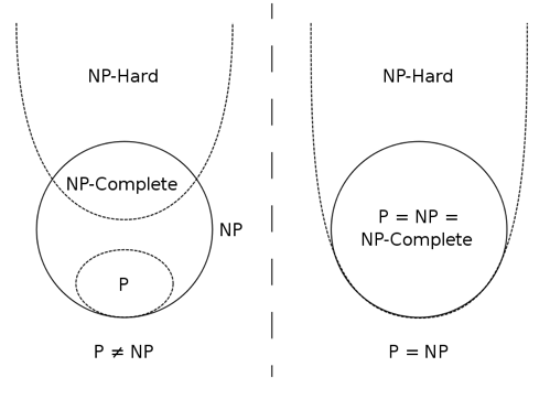
 More realistic representations of these complex systems are possible, however, it requires scholars to consider jettisoning analytical approaches/solutions. When modeling complex adaptive systems far more granularity is possible but this requires a direct consideration of questions of computation and computational complexity. The use of a computational heuristic is really not that problematic and it can help sidestep truly hard problems (i.e. NP Complete and the like). The difficult question is how and under what conditions one should select among the available set of such heuristics.
It is important to note, the dominant paradigm was itself a heuristic representation of agent behavior (and a useful one). While there are still some true believers, a declining number of serious scholars still assert that individuals are actually perfect rational maximizers. At best, this assumption is a useful guidepost for agent behavior and is one which can be subjected to revision by continued work in behavioral economics and neuroeconomics.
For those looking for a genuine intellectual arbitrage opportunity … the path is clear … devote your time to filling the space as this is a space with significant potential returns. The way forward is to remix traditional approaches with leading findings in neuroscience, psychology, institutional analysis and most importantly computer science … winner gets a call from Sweden in about t+25.
Visualizing Bank Failures ( 2008 – 2009 )
Three Takeaways
- Acceleration: There were four failures in the first six months of 2008, followed by another 22 failures in the next six months. By January of 2009, there were 21 failures in the first three months of the year, followed by 138 from April to last Friday.
- Magnitude: Failures in the past two years have cost the Depositors Insurance Fund an estimated $57B. The IndyMac failure of July 2008 accounted for $10B alone, followed by BankUnited at $4.9B and Guaranty Banks at $3B.
- Spatial Correlation: There is a significant amount of spatial correlation in California, Georgia, Florida, Texas, and Illinois. These states account for 77% of the total costs to the Depositors Insurance Fund. Furthermore, most of the losses in California and Georgia were concentrated highly around a few urban centers.
The Movie
The movie below shows the location of bank failures, beginning in 2008 and concluding with the three failed banks from Friday, December 11, 2009. Each green circle corresponds to a bank failure, and the size of each circle corresponds logarithmically to the FDIC’s estimated cost for the Depository Insurance Fund, as stated in the FDIC press releases. For failures with joint press releases, such as the 9 banks that failed on October 30th, the circles are sized in proportion to their relative total deposits.
Our visualization is similar to this one offered by the Wall Street Journal. For sizing the circles, the WSJ relied upon the value of assets at the time of failure. By contrast, our approach focuses upon the estimated impact to the Depositors Insurance Fund (DIF). In several instances, this alternative approach leads to a different qualitative result than the WSJ. For example, consider the case of Washington Mutual. While many have characterized Washington Mutual’s failure as the largest in history, according to the FDIC press release the failure did not actually lead to a draw upon Depositors Insurance Fund. By contrast, the FDIC estimated cost for the IndyMac Bank failure was substantial– the latest available estimate sets it at 10.7 billion.
Additional Background
As reported in a number of news outlets, Friday witnessed the failure of three more banks – Solutions Bank (Overland Park, KS), Valley Capital Bank (Mesa, AZ), and Republic Federal Bank (Miami, FL).
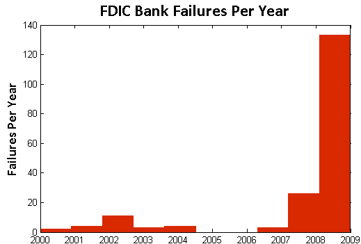
According to information obtained from the Federal Deposit Insurance Corporation (FDIC), there have been a total of 186 bank failures in the United States since 2000. Of these, 159 banks or roughly 85% have occurred in the past two years. The plot below displays the yearly failures since 2000. These 159 failures over the past two years have cost the Depositors Insurance Fund an estimated $57B.
In addition to the increase in the rate of bank failures, there has also been a substantial amount of spatial correlation between these failures. The table below shows the five states with the highest estimated total costs to the Depositors Insurance Fund since 2008. Together, these five states account for $44B of the total $57B in the past two years.
| State | Estimated Cost to Fund |
| California | $19.33B |
| Georgia | $9.29B |
| Florida | $6.77B |
| Texas | $4.56B |
| Illinois | $4.12B |
Who Owns America’s Debt? An Dynamic Perspective on the Major Foreign Holders of Treasury Securities [2002- Present]
Three Things to Notice
(1) China Passes Japan — This dynamic visual demonstrates how in the fall of 2008 China surpassed Japan as the top foreign holder of U.S. Debt.
(2) The Rise of Russia — Notice how Russia becomes a significant holder of U.S. Debt between late-2006 and mid-2007.
(3) The Increasing Amount of U.S. Debt Held Abroad — The pie chart is sized by the total debt held by the current top ten debt holders. As a function of U.S. expenditures over the relevant time period, this pie grows in nearly every time period. In the bottom right corner, we track the total debts held by the current top debt holders. Of course, this alone does not represent the complete picture as there is additional U.S. debt held by a variety of other other countries. Therefore, we also track the grand total of all debts held abroad in the bottom right corner of the visual.
Dynamic Perspective on the Increasing Amount of American Debt Held Abroad
Focusing upon the “Major Foreign Holders of Treasury Securities,” we were interested in considering how today’s major debt holders acquired their top position. The data used the generate the visual above is drawn from United States Department of Treasury. For those interested in replicating our results, the current data is located here and the historical data is located here.


