Tag: financial crisis
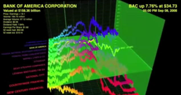
Various Explanations for the Financial Crisis-(From Information Aesthetics)
While the explanations might be imperfect in some respects, we are following the lead of Information Aesthetics and linking you to some videos potentially useful for explaining the financial crisis to a lay audience. Click above and it will lead you to several interesting videos … from there it is possible to traverse the YouTube graph out to see many others.
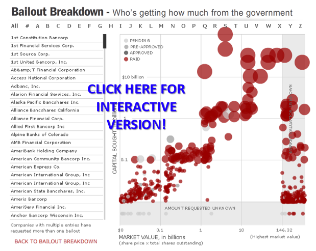
The Bailout Breakdown from the Associated Press
Datavisualization.ch/ recently highlighted this interactive “Bailout Breakdown” offered by the Associated Press….. “Bailout Breakdown from Associated Press is an interactive applet that lets the user analyze the recipients and amounts of the $700 Billion bailout plan from the American government. The data is presented as a scatterplot with additional information about the representations when the hovers over a plotted item. The markers are color coded to distinguish between pending, pre-approved, approved and paid status.” At the end of his post, Benjamin Wiederkehr offers some principled critiques of the visualization techniques employed by the authors. Notwithstanding, we still thought it was still worthy of highlighting.
The Real Estate Roller Coaster — Visualizing the Speculative Bubble
We are working hard to produce more original content for the site. In the meantime, we want to share some of our favorite projects and papers. Many of you have probably seen this visualization of housing prices–including the run up to 2007. For those of you not previously familiar, the authors plotted inflation adjusted US Home Prices (1890-2006) on a roller coaster! Pretty creative stuff….

