
This is the final installment of posts related to Reproduction of Hierarchy? A Social Network Analysis of the American Law Professoriate. Thanks for your emails.
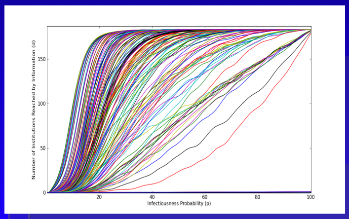
Here is the plot we provide within the paper. As a general proposition, we believe this represents an upper bound measure for the intellectual reach of an agenda offered by a given institution. With respect to our version of the Reed Frost Epidemiological Model, we use the p parameter to model “idea infectiousness.” When p = 1 every institution “contacted” by the idea is infected with the idea. When p = 0 no institution “contacted” by the idea is infected. In this version, we use the programming language python to run the model 500 times per institution. The above plot represents an estimate of the “diffusion curve” for each of the 184 institutions in our model. Building off central limit type properties, this leaves a far better estimate of reach than is offered in the single model run from the previous Netlogo GUI.
A cursory review of the above plot demonstrates, we are far from the land of linearity. Namely, a large number of institutions are able to reach much of the graph with very small changes in the value of p.
In the Structure of Scientific Revolutions, Kuhn quotes from Max Planck: “a new scientific truth does not triumph by convincing its opponents and making them see the light, but rather because its opponents eventually die, and a new generation grows up that is familiar with it.” Following Planck, we believe retirement is indeed be an important mechanism. However, we also argue the nature of the p parameter is a relevant consideration. In fact, unpacking various dimensions of p is the key to the broader model. Specifically, what are the properties of an idea that generate its infectiousness? Of course, we might like to believe infectiousness is related to a class of normatively attractive properties such as promoting efficiency or justice. However, it is not clear that this follows.
We took no pass on the question of whether some institutions would be better or worse at producing ideas with greater or lesser values of p. The motivated question for this post considers whether, in general, the institutions which are top producers of law professors are (1) leaders in innovation, (2) subsequent ratifiers of a newly established paradigm or (3) defenders of the status quo. In a deep sense, we are asking how to reasonably model decision making by the heterogeneous agents located at such institutions. Do institutions reward or punish intellectual risk-taking, search, etc.?
While this is an empirical question beyond the scope of this post, it worth asking because it partially informs the micro-dynamics plausibly responsible for generating the spread of new intellectual paradigms.
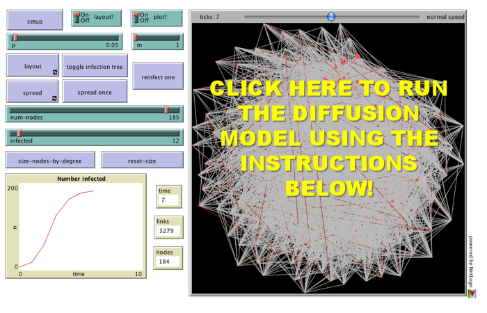 For the third installment of posts related to Reproduction of Hierarchy? A Social Network Analysis of the American Law Professoriate, we offer a Netlogo simulation of intellectual diffusion on the network we previously visualized. As noted in prior posts, we are interested legal socialization and its role in considering the spread of particular intellectual or doctrinal paradigms. This model captures a discrete run of the social epidemiological model we offer in the paper. As we noted within the paper, this represents a first cut on the question—where we favor parsimony over complexity. In the paper and in the model documentation, we offer some possible model extensions which could be considered in future scholarship.
Once you click through to the model, here is how it works:
(1) Click the Setup Button in the Upper Left Corner. This will Display the Network in the Circular Layout.
(2) Click the Layout Button. Depending upon the speed of your machine this may take up to 30 seconds. Stop the Layout Button by Re-Clicking the Button.
(3) Click the Size Nodes by Degree Button. You Will Notice the Fairly Central Node Colored in Red. This is School #12 Northwestern University Law School. Observe how we have set the default infected school as #12 Northwestern (Hat Tip to Uri Wilensky). A Full List of School Number is available at the bottom of the page when you click through.
(4) Now, we are ready to begin. Click the Spread Once Button. The idea then reaches its neighbors with probability p (set as a default at .05). You can click the Toggle Infection Tree button (at any point) to observe the discrete paths traversed by the idea.
(5) Click the Spread Once Button, again and again. Notice the plot tracking the time on the x axis and the number of institution infected on the y axis. This is an estimate of the diffusion curve for the institution.
(6) To restart the simulation, click the Reinfect One button. Prior to hitting this button, slide the Infected Slider to any Law School you would like to observe. Also, feel free to adjust the p slider to increase or decrease the infectiousness of the idea.
Please comment if you have any difficulty or questions. Note you must have Java 1.4.1 + installed on your computer. The Information Technology professionals at many institutions will have already installed this on your machine but if not you will need to download it. We hope you enjoy!
This is the second post related to our recently released paper Reproduction of Hierarchy? A Social Network Analysis of the American Law Professoriate. We believe a hierarchical depiction of the network helps uncover latent distribution of authority present in the law professor network. Specifically, between 10-15 law schools are responsible socializing a significant percentage of the future legal academics.
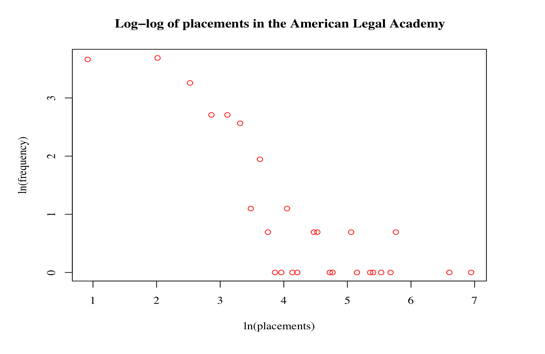
This extreme skewing of social authority presented in the visualization is also displayed in the above log-log of the degree distribution. While the -1.93 alpha level and size of the network falls outside the traditional power law/scale free range, the plot above does demonstrate the extreme skewing of social authority among institutions of legal education.
This is the time of year when there is significant discussion of the US News Rankings. We believe there is a wide-class of available data—data which could be characterized as the revealed preferences of important actors within the American legal system. For example, we have previous offered information on how judges select clerks from law schools? Now, we offer some empirical insight into how hiring committees vote over various institutions?
Coming later in the week, we will offer a Netlogo GUI which allows a user to start ideas at various institutions and observe how many generations they take to spread from institution to institution. There are significant caveats in the interpretation of our model but we think many people will still find it interesting. Please stay tuned and as always please tell your friends and colleagues about the CLS Blog!
Last month, my colleagues and I posted Reproduction of Hierarchy? A Social Network Analysis of the American Law Professoriate to the SSRN. We have been quite happy with the initial response to the article. It has been posted on a number of blogs including ELS Blog, Tax Prof Blog, Legal Theory Blog, US News and World Report Blog as well as several others.
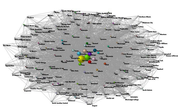
To develop the network, our paper uses an approach first developed in the network science literature by Fowler, Grofman & Masuoka. The network visualized above relies upon mapping the institution where an individual received their primary legal socialization to the institution where that individual acts to socialize the next generation. The example below demonstrates the move from our data set to the full graph of 184 Institutions and 7,200+ Professors. In the full graph, the institutions are sized by the number of inbound connections. Harvard Law School has the largest number of placements and is the largest node contained in the graph.
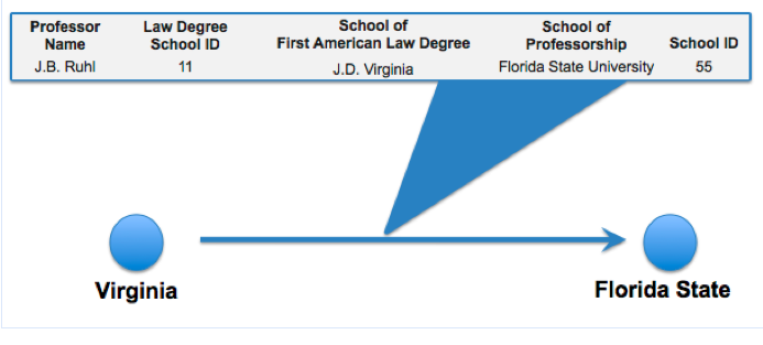
This is first of a multipart series of posts regarding the ideas contained in the paper. In subsequent posts, I hope to comment on a variety of matters including how we use the above network to computationally model spread of intellectual and doctrinal paradigms. To preview, we use the above network architecture in a Reed-Frost style social epidemiological model.
I am currently at Vanderbilt Law School for the 2009 Society for Evolutionary Analysis in Law (SEAL) Conference. For those of you not familiar with the organization … “SEAL is a scholarly association dedicated to fostering interdisciplinary exploration of issues at the intersection of law, biology, and evolutionary theory, improving the models of human behavior relevant to law, and promoting the integration of life science and social science perspectives on law-relevant topics through scholarship, teaching, and empirical research.” The organization embraces a wide range of scholarship including those with interests in evolutionary and behavioral biology, complex adaptive systems, economics, psychology, primatology and anthropology.
In the coming days, we will be highlighting our work on The American Legal Academy and previewing extensions of the paper Reproduction of Hierarchy? A Social Network Analysis of the American Law Professoriate. So stay tuned for this and more… please add us to your blogrolls and tell your colleagues about the CLS Blog.
In honor of Tax Day, we’ve produced a simple time series representation of the Supreme Court and tax. The above plot shows the how often the word “tax” occurs in the cases of the Supreme Court, for each year – that is, what proportion of all words in every case in a given year are the word “tax.” The data underneath includes non-procedural cases from 1790 to 2004. The arrows highlight important legislation and cases for income tax as well.
Make sure to click through the image to view the full size.
Happy Tax Day!
OpenSecrets.org went open with their data today. In honor of this very significant act and its ramifications on future government transparency, I’ve decided to produce a quick visualization to answer a question I’ve long been intrigued by – the publicly traded holdings of Senators. One good proxy to this question is the Personal Financial Disclosure data released today by Open Secrets. In the words of Open Secrets,
Any legal ownership a person has in a company or property is classified as an asset, including brokerage accounts, corporate bonds and stocks. For the most part, lawmakers seem to have a stake in big-name, recognizable companies and properties. They need to report only assets worth more than $1,000 at the end of the calendar year, or producing more than $200 of income. (One note about mutual funds: Filers are not required to provide detail on funds’ individual holdings.) Any purchases, sales or exchanges of assets during the year of more than $1,000 must be disclosed as transactions. Reporting the value of a primary residence, unless it produces income, is not required.
This visual represents a very rough cut of this data for the holdings of Senators in 2007. As is often the case with real form data, there are inconsistencies across the data set. Ideally, one could simply use the asset’s description, which would accurately report the assets held in an account. However, as these are not always provided, the “asset source” is used in their absence. When combined with the mutual fund issues mentioned above, blind trust reporting, and these possible transcription errors, there is a compelling case against strict interpretation of this visual. In any case, enjoy the visual, and again, thanks to Open Secrets for their monumental move forward!
Title 26 of the United States Code is likely on the mind of many as we move toward April 15th. As a part of a project with Lilian V. Faulhaber (Climenko Fellow from HLS), we have become interested in the architecture of 26 U.S.C. ___.
As we define it, a “section depth” representation for 26 U.S.C. 501(c)(3) represents a traversal to the level of Sec. 501. While a “full depth” representation would include a mapping beyond Sec. 501 to its (c) and (3) subcomponents. In our previous post highlighting 11 U.S.C. __ (the Bankruptcy Code), we presented a traversable “full depth” representation for its structure.
Considering all 50 titles of the United States Code, 26 U.S.C. __ is among the largest of the titles in its architectural size and depth. In fact, given its size, it is not possible for us to render for public consumption, a labeled, “full depth” and zoomable representation for all of 26 U.S.C. ___.
Above we provide a “section depth” representation for 26 U.S.C __ where the terminal nodes are sections such Sec. 1031. You will notice that this section depth representation is roughly the size of the full depth representation we provide for 11 U.S.C. ___. We have colored in Green the primary Income Tax Sections under 26. The documentation is similar to that for 11 U.S.C. ___ thus please refer to this post for additional information. However, for traversal purposes, it is important to remember to start in the middle at the “26 U.S.C.” and follow the branch of the graph out to a leaf node.
We believe the comparative consideration of the architecture for these titles offers a rough first cut on questions of code magnitude and complexity. Although it is a first order approximation and we do believe layering in the relevant administrative regulations and jurisprudence to these sections would represent an improvement on the question, it still bears asking whether it would drastically alter the macro state of affairs. That is an empirical question and only time will tell.
COMING NEXT WEEK:
In our lead up to April 15th…it is TAX WEEK on the CLS Blog.
This and more coming soon…
In our previous graph visualizations of contributions to members of the House and Senate, there have been two types of entities: Contributors and Congressmen. This division manifests itself in the dynamics of the graph as well – Contributors give only to Congressmen, and Congressmen receive only from Contributors. A network with this property is bipartite, and there are a number of additional ways to represent the relations contained therein.
One such representation is called the single-mode projection. In this simplification, only elements from one of the two sets (e.g., Congressmen or Contributors) are displayed. A relationship exists between two elements in the visual if they share a relationship with at least one member of the other group. For instance, both Bernie Sanders and Sam Brownback received campaign contributions from the the National Association of Realtors. Thus, the Congressmen both have a relationship with the same Contributor, and the simplest single-mode projection would represent this as a shared relationship between the two Congressmen. For more on this projection or other representations, see Wasserman and Faust (1994) or M. E. J. Newman, S. H. Strogatz, and D. J. Watts, Phys. Rev. E 64, 026118 (2001).
As the Sanders-Brownback example above demonstrates, however, it is relatively easy to be connected in this representation. Thus, we enforce a threshold on the number of shared contributors for a relationship to exist – representatives must shared at least 10 contributors in order for a relationship to exist between them. It is important to note that different thresholds may produce different graphs. We have chosen this figure as it represents roughly half the number of major contributors to the typical representative. Obviously, alternative specifications are possible. In future posts, we may present different thresholds or normalizations. However, for now, we believe this is a simple but appropriate representation for the underlying data.
Given the requirement of sharing at least 10 contributors with another member, the above visualization no longer contains every member of the House of Representatives. To observe the full graph, please see our first post on the contributions to the House.
Interpreting this visual is very similar to previous visuals, and in many ways simpler. Other than points (1) and (2) below, again refer to our first post on the contributions to the House.
(1) SIZING of the CONNECTIONS — Each Connection (Arc) between an Institution and a Member of the House is sized according to the amount of money flowing through a connection. Darker connections represent larger flows of money while lighter connections represent smaller amounts of money.

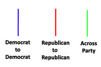
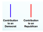
(2) COLORING of the CONNECTIONS — Each connection representing a shared campaign contributor from between members of Congress is colored according to partisan affiliation. Using popular convention, we color shared relationships between Republican Party members as Red, and blue for shared relationships between Democratic Party members. For relationships that span across the party lines, the color green is used.
DOCUMENTATION FOR THE VISUALIZATION
University of Michigan
Center for the Study of Complex Systems
Department of Political Science
BASIC OVERVIEW:
110th Congress = January 3, 2007 – January 3, 2009
435 Voting Members of the United States House of Representatives + District of Columbia (Eleanor Holmes Norton) + Puerto Rico (Luis Fortuno) + Virgin Islands (Donna Christian-Green) + American Samoa (Eni F H Faleomavega) + Guam (Madeleine Z Bordallo)
Click here and here for the Senators of the 110th Congress.
BASIC RULE:
Squares (Institutions) Introduce Money into the System and Circles (Congressmen) Receive Money.
DATA OVERVIEW:
Using recently published data on campaign contributions collected by the Federal Election Commission and aggregated by the Center for Responsive Politics our visualizations track large money donations to members of the 110th Congress over the 2007 – 2008 window.
It is important to note that most of these organizations did not directly donate. Rather, as noted by the Center for Responsive Politics “the money came from the organization’s PAC, its individual members or employees or owners, and those individuals’ immediate families. Organization totals include subsidiaries and affiliates. Of course, it is impossible to know either the economic interest that made each individual contribution possible or the motivation for each individual giver. However, the patterns of contributions provide critical information for voters, researchers and others.”
The Center describes its methodology here http://www.opensecrets.org/politicians/method_pop.php.
To provide for an optically tractable view of the top contributions, we follow the CRP and impose the limiting requirement that to be included in our tally a given group’s contribution must fall within a given house members top contributor list.
We try to strike a tradeoff between information overload and incomplete disclosure.
In coming days, we will provide an additional visualization of the underlying data. Check back soon!
CONTRIBUTORS & CONTRIBUTIONS:
2,508 of the Donors are captured in the Graph.
Total Recorded Donations Introduced into our Visualization by these Entities Total to $113,134,698
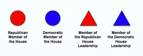
(1) SIZING of the REPRESENTATIVE NODES — Each Circular node representing a Member of the House is sized according the amount of incoming donations. Thus, larger nodes are the recipients of larger sums of money while the smaller nodes received smaller amounts of money.

(2) COLORING and SHAPES of the REPRESENTATIVE NODES — Each node representing a Member of the United States House of Representatives is colored according their Political Party. Using popular convention, we color members of the Republican Party as Red and members of the Democratic Party as Blue.
(3) SIZING of the CONNECTIONS — Each Connection (Arc) between an Institution and a Member of the House is sized according to the amount of money flowing through a connection. Darker connections represent larger flows of money while lighter connections represent smaller amounts of money.
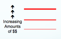
(4) COLORING of the CONNECTIONS — Each connection representing a campaign contribution from an entity to a member of Congress is colored according to partisan affiliation of the receiving representatives. Using popular convention, we color members of the Republican Party as Red and members of the Democratic Party as Blue.
(5) STRUCTURE OF THE GRAPH — The Graph is Visualized Using Fruchterman-Reingold. This is an automated spring embedded, force directed placement algorithm often used in the network science literature to visualize graphs of this size.
(6) ACKNOWLEDGEMENTS — We thank Rick Riolo, Jon Zelner, Carl Simon, Scott Page and the Center for Responsive Politics for their comments, contributions and/or data.
I recently attended a conference at the Santa Fe Institute. During the trip, I made a point of eating at the El Farol Bar & Restaurant. This restaurant holds a special place in the lore of complex systems. Thus, I thought I would take the opportunity to highlight the model on the CLS blog.
Here is a subset of the model description…. “The bar is popular — especially on Thursday nights when they offer Irish music — but sometimes becomes overcrowded and unpleasant. In fact, if the patrons of the bar think it will be overcrowded they stay home; otherwise they go enjoy themselves at El Farol. This model explores what happens to the overall attendance at the bar on these popular Thursday evenings, as the patrons use different strategies for determining how crowded they think the bar will be.”
The original paper written by Brian Arthur is located here. An interesting follow up paper employing reinforcement learning is located here. This above is a screen print from the Netlogo model. Netlogo offers an easy interface useful for exploring a variety of agent based models.
The model will run in your browser provided you have Java 1.4.1+.
To run the El Farol model, please go here.
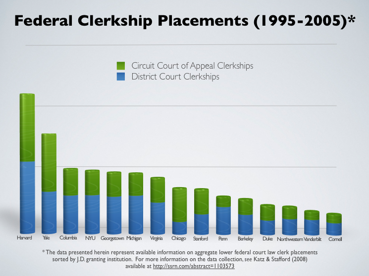
Judge Wald’s classic article describing the market for judicial clerks reminds us how April was once the cruellest month. Given the Federal Law Clerk Hiring plan has shifted the relevant window of discomfort, we thought it reasonable to ring in the spring season with some of our data on the law clerk tournament. Using underlying information Derek Stafford and I collected for our article Hustle and Flow: A Social Network Analysis of the American Federal Judiciary, here is Federal Court Clerkship data for the period of the “Natural” Rehnquist Court. The current offering is aimed at the US News Top 15 Law Schools. Although this data terminates in the 2004- 2005 clerkship year, we still believe it offers useful empirical insight into the status of the law clerk tournament.
One of our very first posts highlighted a recent article in Science Magazine describing the possibilities of and perils associated with a computational revolution in the social sciences. A very timely article by Paul Ohm (UC-Boulder Law School) entitled Computer Programming and the Law: A New Research Agenda represents the legal studies analog the science magazine article. From information retrieval to analysis to visualization, we believe this article outlines the Computational Legal Studies playbook in a very accessable manner.
Prior to founding this blog, we had little doubt that developments in informatics and the science associated with Web 2.0 would benefit the production of a wide class of theoretical and empirical legal scholarship. In order to lower the costs to collective action and generate a forum for interested scholars, we believed it would be useful to produce the Computational Legal Studies Blog. The early results have been very satisfying. For example, it has helped us link to the work of Paul Ohm.
For those interested in learning more about not only the potential benefits of a computational revolution in legal science but also some of the relevant mechanics, we strongly suggest you consider giving his new article a read!