FULL SCREEN FOR BETTER VIEWING!
Click on this icon to view the Movie in Full Screen Mode!![]()
STATIC SNAPSHOT TO DYNAMIC ANIMATION
In our prior post analyzing the email database of Climate Research Unit at the University of East Anglia, we aggregated all emails over the relevant 1997-2009 time period into a single static visualization. Specifically, to build the network, we processed every email in the leaked data. Each email contains a sender and at least one recipient on the To:, Cc:, or Bcc: line.
One obvious shortcoming associated with producing a static snapshot for data set, is that it often obscures the time evolving dynamics of interaction which produced the full graph. To generate a dynamic picture, it is necessary to collect time stamped network data. In the current case, this required acquisition of the date field for each of the emails. With this information, we used the same underlying data to generate a dynamic network animation for the 1997-2009 time window.
HOW TO INTERPET THE MOVIE
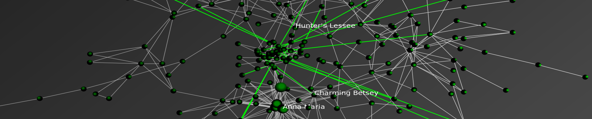
Consistent with the approach offered in our prior visualization, each node represents an individual within the email dataset while each connection reflects the weighted relationship between those individuals. The movie posted above features the date in the upper left. As time ticks forward, you will notice that the relative social relationships between individuals are updated with each new batch of emails. In some periods, this updating has significant impact upon the broader network topology and at other time it imposes little structural consequences.
In each period, both new connections as well as new communications across existing connections are colored teal while the existing and dormant relationships remain white. Among other things, this is useful because it identifies when a connection is established and which interactions are active at any given time period.
A SHORT VERSION AND A LONG VERSION
We have two separate versions of the movie. The version above is a shorter version where roughly 13 years is displayed in under 2 minutes. In the coming days, we will have a longer version of the movie which ticks a one email at a time. In both versions, each frame is rendered using the Kamada-Kawai layout algorithm. Then, the frames are threaded together using linear interpolation.
SELECTION EFFECTS
Issues of selection of confront many researchers. Namely, given the released emails are only a subset of the broader universe of emails authored over the relevant time window, it is important to remember that the data has been filtered and the impact of this filtration can not be precisely determined. Notwithstanding this issue, our assumption is that every email from a sender to a recipient represents a some level of relationship between them. Furthermore, we assume that more emails sent between two people generally indicates a stronger relationship between those individuals.
DIMENSIONALITY
In our academic scholarship, we have confronted questions of dimensionality in network data. Simply put, analyzing network data drawn from high dimensional space can be really thorny. In the current context, a given email box likely contains emails on lots of subjects and reflects lots of people not relevant to the specific issue in question. Again, while we do not specifically know the manner in which the filter was applied, it is certainly possible that the filter actually served to mitigate issues of dimensionality.
ACCESS THE DATA
For those interested in searching the emails, the NY Times directs the end user to http://www.eastangliaemails.com/