Real Time Visualization of US Patent Data [Via Infosthetics]

Patent Data Visualization

Using data dating back to 2005 and updating weekly using information from data.gov the Typologies of Intellectual Property project created by information designer Richard Vijgen offers almost real time visualization of US Patent Data.

From the documentation … “[T]ypologies of intellectual property is an interactive visualization of patent data issued by the United States Patent and Trademark Office.  Every week an xml file with about 3000 new patents is published by the USTPO and made available through data.gov.  This webapplication provides a way to navigate, explore and discover the complex and interconnected world of idea, inventions and big business.”

Once you click through please note to adjust the date in the upper right corner to observe earlier time periods.  Also, for additional information and/or documentation click the “about this site” in the upper right corner.  Enjoy!

Positive Legal Theory and a Model of Intellectual Diffusion on the American Legal Academy [Repost from 4/22]

For the third installment of posts related to Reproduction of Hierarchy? A Social Network Analysis of the American Law Professoriate, we offer a Netlogo simulation of intellectual diffusion on the network we previously visualized.  As noted in prior posts, we are interested legal socialization and its role in considering the spread of particular intellectual or doctrinal paradigms. This model captures a discrete run of the social epidemiological model we offer in the paper.   As we noted within the paper, this represents a first cut on the question—where we favor parsimony over complexity.  In reality, there obviously exist far more dynamics than we engage herein.  The purpose of this exercise is simply to begin to engage the question. In our estimation, a positive theory of law should engage the sociology of the academy — a group who collectively socialize nearly every lawyer and judge in the United States. In the paper and in the model documentation, we offer some possible model extensions which could be considered in future scholarship.

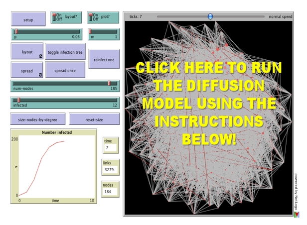
Once you click through to the model, here is how it works:

(1) Click the Setup Button in the Upper Left Corner.  This will Display the Network in the Circular Layout.

(2) Click the Layout Button.  Depending upon the speed of your machine this may take up to 30 seconds.  Stop the Layout Button by Re-Clicking the Button.

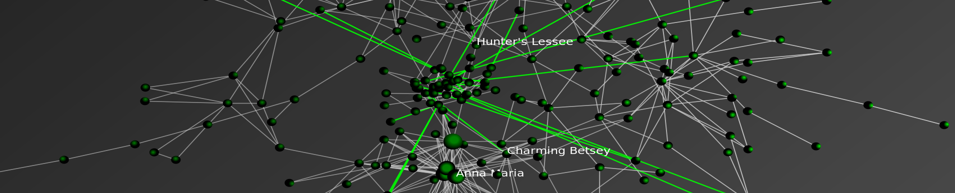
(3) Click the Size Nodes by Degree Button. You Will Notice the Fairly Central Node Colored in Red.  This is School #12 Northwestern University Law School.  Observe how we have set the default infected school as #12 Northwestern (Hat Tip to Uri Wilensky).  A Full List of School Number is available at the bottom of the page when you click through.

(4) Now, we are ready to begin.  Click the Spread Once Button.  The idea then reaches its neighbors with probability p (set as a default at .05).  You can click the Toggle Infection Tree button (at any point) to observe the discrete paths traversed by the idea.

(5) Click the Spread Once Button, again and again.  Notice the plot tracking the time on the x axisand the number of institution infected on the y axis.  This is an estimate of the diffusion curve for the institution.

(6) To restart the simulation, click the Reinfect One button.  Prior to hitting this button, slide theInfected Slider to any Law School you would like to observe.  Also, feel free to adjust the p slider to increase or decrease the infectiousness of the idea.

Please comment if you have any difficulty or questions.  Note you must have Java 1.4.1 + installed on your computer.  The Information Technology professionals at many institutions will have already installed this on your machine but if not you will need to download it.   We hope you enjoy!

Forest Fire Model-A Popular Example of Non-Linearity [Repost from 5/13]

Forest Fire Model

The Forest Fire Model is a commonly invoked example of non-linear system–where a very small perturbation can generate significant differences in observed outcomes. Consider the above Netlogo–to Run the Model: (1) Adjust the Density Slider to set the concentration within the Forest.  (2) Hit the Setup Button (3) Hit the Go Button  …. Rinse and Repeat at different levels of Density.

Above is the output for a run of the model at several levels of Density {48%, 56%, 62%}.  Notice the differences in the Percent Burned {1.6%, 5.2%, 86.5%}.

This is obviously a theoretical model but it has potential application to a wide class of substantive questions including regulatory failure.  In addition, the Forest Fire Model is important because it has been invoked in the critique of the popular book The Tipping Point. Specifically, in discussing the book network scientist Duncan Watts notes “It sort of sounds cool … But it’s wonderfully persuasive only for as long as you don’t think about it.” Watts notes “…trends are more like forest fires: There are thousands a year, but only a few become roaring monsters. That’s because in those rare situations, the landscape was ripe: sparse rain, dry woods, badly equipped fire departments. If these conditions exist, any old match will do…. and nobody… will go around talking about the exceptional properties of the spark that started the fire.” (Quotes from Jan 2008 Is the Tipping Point Toast? Fast Company Magazine).

Death and Taxes 2010 — Using the Zoomorama Interface

Death and Taxes is an infographic classic created by Jess Bachman. The new version for 2010 is now available.  Place the cursor over the graphic and wait for the {+,-} to show up.  Then, zoom in read any part of the poster.  Click and hold to move side to side.  For more information or to order a poster … click through to Wall Stats.  It is worth the click through as Wall Stats features a fully searchable legend which will autozoom on major executive agencies.

Power Laws, Preferential Attachment and Positive Legal Theory [Part 2] [Repost]

Law as a Complex System?

As was stated in Part 1 of this thread, it is by no means a given that the statistical artifact displayed above would appear. Namely, such large scale patterns need not assume this flavor as many social and physical systems feature substantially different properties.

For purpose of generating an empirically grounded theory of American Common Law development … explaining these artifacts would seem to critical. Fortunately, with respect to the above pattern, there exist a definable set of generative processes plausibly responsible for producing what is displayed. While certainly not the only generative process responsible for a power law, the preferential attachment model, first outlined in the physics literature by Barabási & Albert, is among the likely candidates.

Confronting much of the extant literature, query as to whether a closed form equilibria based analytical apparatus (punctuated or otherwise) is up to the task of describing the relevant dynamics? If anything, the distributions displayed above provide first-order evidence of a system which is likely to feature dynamics of a non-linear flavor. Indeed, while significant work still remains, the weight of available evidence indicates Law is a Complex Adaptive System. As such, we believe it would be appropriate to leverage the methods typically reserved for the study of complexity.  For purposes of generating positive legal theory, we believe agent based models, dynamic network analysis and other methods of computational social science offer great potential. We encourage scholars to consider learning more about these approaches.

Visualizing Dynamic Networks with Python, Igraph, and SONIA

igraph2sonia Example 1 from michael bommarito on Vimeo.

When it comes to quickly motivating a point or engaging students in a classroom, one of the most effective tools is visualization. Not only do movies provide fun and excitement, but they also allow viewers to leverage the abilities of the visual cortex to infer dynamics and patterns in the animated system.

For our recent research, dynamic graphs are the type of system of interest. As I’ve covered before, Python is my language of choice for most programming tasks. Furthermore, Python is a very accessible language, even for beginners. However, when it comes to visualizing dynamic networks, we need another tool.  Our tool of choice is SONIA, the Social Network Image Animator.

I thought I’d provide a helpful little function to generate SONIA input files from igraph objects, along with a few examples.

This function takes as input an igraph.Graph object and a file name to store the SONIA output in. Every vertex in the Graph object should have a time attributed specified, either simply as an integer indicating the start time, or as a tuple or list of the form (startTime,endTime). Check out the following two examples if you need more guidance. Both examples visualize the construction of a periodic lattice. However, in the second example, nodes decay after some random time. Make sure not to miss the second video at the bottom of the post!


igraph2sonia Example 2 from Michael J Bommarito II on Vimeo.

Sea Dragon Visualization of the American Legal Academy


Here is another visual run through the SeaDragon Visualization from Microsoft Labs.  Similar to the Title 17 United States Code visual from earlier in the week, one can zoom in and out. Using the button in the far southeast corner it is possible to generate a full screen visual of the network.

Pervious posts discussing this visualization are located  here and  here. In addition, results of our model of diffusion on the network are located here while an interactive version of the agent based model generated in Netlogo is located here.  For those interested in the full draft … it is entitled Reproduction of Hierarchy? A Social Network Analysis of the American Law Professoriate.