
As reported in the NY Times … roughly 160,000 hours of C-SPAN coverage is going live for your consumption. Yet another example that the Era of Big Data is upon us!
As reported in the NY Times … roughly 160,000 hours of C-SPAN coverage is going live for your consumption. Yet another example that the Era of Big Data is upon us!

The cover story of this week’s Economist is entitled The Data Deluge. This is, of course, a favorite topic of the hosts of this blog. While a number of folks have already highlighted this trend, we are happy to see a mainstream outlet such the Economist reporting on the era of big data. Indeed, the convergence of rapidly increasing computing power, and decreasing data storage costs, on one side, and large scale data collection and digitization on the other … has already impacted practices in the business, government and scientific communities. There is ample reason to believe that more is on the way.
In our estimation, for the particular class of questions for which data is available, two major implications of the deluge are worth reiterating: (1) no need to make assumptions about the asymptotic performance of a particular sampling frames when population level data is readily available; and (2) what statistical sampling was to the 20th century, data filtering may very well be to the 21st ….

Download the paper: Collins, Christopher; Viégas, Fernanda B.; Wattenberg, Martin. Parallel Tag Clouds to Explore Faceted Text Corpora To appear in Proceedings of the IEEE Symposium on Visual Analytics Science and Technology (VAST), October, 2009. [Note: The Paper is 24.5 MB]
Here is the abstract: Do court cases differ from place to place? What kind of picture do we get by looking at a country’s collection of law cases? We introduce Parallel Tag Clouds: a new way to visualize differences amongst facets of very large metadata-rich text corpora. We have pointed Parallel Tag Clouds at a collection of over 600,000 US Circuit Court decisions spanning a period of 50 years and have discovered regional as well as linguistic differences between courts. The visualization technique combines graphical elements from parallel coordinates and traditional tag clouds to provide rich overviews of a document collection while acting as an entry point for exploration of individual texts. We augment basic parallel tag clouds with a details-in-context display and an option to visualize changes over a second facet of the data, such as time. We also address text mining challenges such as selecting the best words to visualize, and how to do so in reasonable time periods to maintain interactivity.
We have spent the past couple days at the University of Pennsylvania where we presented information about our efforts to compile a complete United States Supreme Court Corpus. As noted in the slides below, we are interested in creating a corpus containing not only every SCOTUS opinion, but also every SCOTUS disposition from 1791-2010. Slight variants of the slides below were presented at the Penn Computational Linguistics Lunch (CLunch) and the Linguistic Data Consortium(LDC). We really appreciated the feedback and are looking forward to continue our work with the LDC. For those who might be interested, take a look at the slides embedded below or click on this link:
During our break from blogging, Ian Ayers offered a very interesting post over a Freakonomics entitled “Prediction Markets vs. Super Crunching: Which Can Better Predict How Justice Kennedy Will Vote?” In general terms, the post compares the well known statistical model offered by Martin-Quinn to the new Supreme Court Fantasy League created by Josh Blackman. We were particularly interested in a sentence located at end of the post … “[T]he fantasy league predictions would probably be more accurate if market participants had to actually put their money behind their predictions (as with intrade.com).” This point is well taken. Extending the idea of having some “skin in the game,” we wondered what sort of intellectual returns could be generated for the field of quantitative Supreme Court prediction by some sort of Netflix style SCOTUS challenge.
The Martin-Quinn model has significantly advanced the field of quantitative analysis of the United States Supreme Court. However, despite all of the benefits the model has offered, it is unlikely to be the last word on the question. While only time will tell, an improved prediction algorithm might very well be generated through the application of ideas in machine learning and via incorporation of additional components such as text, citations, etc.
With significant financial sum at stake … even far less than the real Netflix challenge … it is certainly possible that a non-trivial mprovement could be generated. In a discussion among a few of us here at the Michigan CSCS lab, we generated the following non-exhaustive set of possible ground rules for a Netflix Style SCOTUS challenge:
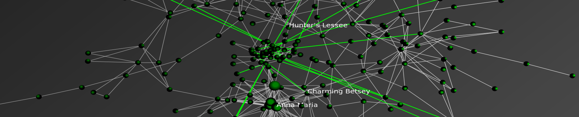
Based on the Farouk1986 Gawaher data posted earlier this week, we have analyzed the communication network of the alleged Christmas Day Bomber, Umar Farouk Abdulmutallab.
Using the handle “Farouk1986,” Abdulmutallab was a regular participant on the Islamic forum Gawaher.com. Several years prior to the Christmas Day incident, the alleged Christmas Day Bomber took part in a significant number of communications. Of course, these communications can be analyzed in a number of ways. For example, over at Zero Intelligence Agents, Drew Conway has already done some useful initial analysis. We sought to contribute our analysis of the time-evolving communication network contained within these posts. While more extensive documentation is available below, in reviewing the dynamic network visualization, consider the following observations:
Click on the Full Screen Button! (4 Arrow Symbol in the Vimeo Bottom Banner)
#1) “Farouk1986” Entered an Existing Network Which Appeared to Increase the Salience of Religion in His Life
Although individuals in society may feel isolated or appear to be loners, the internet offers like minded, potentially meaningful networks of people with whom to connect. These internet is full of communities of individuals who interests are wide ranging—including topics such as Blizzard’s World of Warcraft, sports, culinary interests or religion. With whatever prior beliefs he held, “Farouk1986” entered this subset of the broader Islamic online community in late 2004. While it is not possible for us to make definitive conclusions, it appears that the community with whom he connected increased the salience of religion in his life. In other words, through the internet “Farouk1986” experienced a reinforcing feedback and this likely primed him for further radicalization.
#2) The Network of “Farouk1986” Grows Increasingly Stable Once Established
“Farouk1986” increasingly communicated with the same set of individuals over the window in question. Thus, while communication continued to flow through the network … the network, once established, remains fairly stable. In other words, instead of being exposed to diverse sets of individuals, “Farouk1986” continued to communicate with the same individuals. In turn, those direct contacts also continued to communicate with the same individuals.
#3) Additional Streams of Data Would Enhance Analysis
The forum posts which serve as the data for this analysis are only a subset of the communication network experienced by Umar Farouk Abdulmutallab. Additional streams of relevant data would include phone records, emails, participation in other forums, etc. would likely enhance the granularity of our analysis. If you have access to such data and are legally authorized to share it-please feel free to contact us.
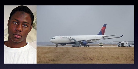
For those not already familar with the case, Umar Farouk Abdulmutallab is charged with willful attempt to destroy an aircraft in connection with the December 25, 2009 Delta Flight 253 from Amsterdam to Detroit. Like many, we wondered precisely what path led the son of a wealthy banker to find himself as a would be suicide bomber. While these communications represent only a small portion of the broader picture, a number of illuminating analyses can still be conducted using this available information.
Using the handle “Farouk1986,” Umar Farouk Abdulmutallab was a regular participant on the popular Islamic forum Gawaher.com. Thus, as a small contribution to the broader analysis of the Christmas Day Incident, we have generated a basic visualization and analysis of the time-evolving structure of the Farouk1986 online communication network.
As a major Islamic forum, Gawaher.com features a tremendous number of participants and a wide range of post on topics including Islamic culture, religion, international football, politics, etc.
Given our specific interest in the online behavior of Umar Farouk Abdulmutallab, we were most interested in analyzing the direct and indirect communication network associated with the handle “Farouk1986” (aka Umar Farouk Abdulmutallab). Therefore, it was necessary to filter the broader universe of communication on Gawaher.com to the relevant subset.
A portion of this information is contained in publically available NEFA dataset. While useful, we determined that this dataset alone did not include the information necessary for us to construct the Farouk1986 secondary/indirect communications network. In order to obtain a better understanding of this communication network, we retrieved every “topic” in which Farouk1986 participated at least once. Each “topic” is comprised of one or more “posts” from one or more users. Each “post” may be in response to another user’s “post.” The NEFA data contains only posts made by Farouk1986 – our data contains the entire context within which his posts existed.
Building from this underlying data, we sought to both visualize and analyze the time evolving structure of the “Farouk1986” communication network. For those not familiar with network visualization and analytic techniques—networks consist of both nodes and edges.
In the animation offered above, each “node” is an author. The labels of all best the most central authors have been removed for visibility purposes. Each “edge” is a weighted connection between two authors, where the weight is the strength of connection between each individual. Thus, within the communication network, thicker edges represent more communications while thinner edges reflect fewer communications.
In the visualization, you will notice most nodes are colored black. For purposes of ocular differentiation, the Farouk1986 node is colored red. In addition, we color direct communications with Farouk1986 in red and communications not directly involving Farouk1986 in black.
Given each forum post is datestamped, we can order the network such that the animation reflects the changing composition of the Farouk1986 online communication network. The datestamp is reflected in the upper left corner of animation. Our analysis is limited to the 2004-2005 time period when Farouk1986 was a regular participant.
The network is visualized in each time step using the Kamada-Kawai Visualization Algorithm. Kamada-Kawai is spring embedded force directed placement algorithm commonly used to visualize networks similar to the one considered herein. In order to smooth the visual while not undercutting the qualitatively results, we apply linear interpolation between frames.
The following are the ten most central participants in the network, as measured by weighted eigenvector centrality:
| Author | Centrality |
| Crystal Eyes | 1 |
| property_of_allah | 0.84 |
| Farouk1986 | 0.81 |
| amani | 0.69 |
| Mansoor Ansari | 0.61 |
| sis Qassab | 0.55 |
| muslim mujahid | 0.49 |
| Arwa | 0.43 |
| sister in islam | 0.31 |
| Anj | 0.29 |
(a) Computational Linguistic Analysis of the Underlying Posts
Over what substantive dimensions did these networks of direct and indirect communication form?
(b) Recursive Growth of the Network
Friends-Friends-Friends and so on….
(c) Complete Analysis of the Gawaher.com Forum
Were the patterns of communications by Farouk1986 noticeably different from other forum participants?
(d) Linkage of Content and Structure
What is the nature of information diffusion across the Gawaher.com?
How did this differ by substantive topic?
 Drew Conway over at Zero Intelligence Agents brought to our attention the Farouk1986 data set provided by Evan Kohlman from the NEFA Foundation. For those not familiar, Umar Farouk Abdulmutallab, who is charged with willful attempt to destroy an aircraft in connection with the Christmas Day Flight 253 from Amsterdam to Detroit, made a number of posts to the Islamic Forum Gawaher.com using the handle “Farouk1986.”
This data is useful and some good initial analysis has been offered at ZIA as well as other sites across the blogosphere. Moving beyond this initial analysis, we thought it would be helpful to analyze this set within the broader context of Umar Farouk Abdulmutallab’s posts. Thus, we downloaded the entire thread for each post in the NEFA data set — including content from many other authors.
Having this content allows us to understand the broader context of Abdulmutallab communications … including to what Abdulmutallab was responding and how others in the relevant community responded to his contributions. We have parsed the data into threads and posts, and for each post, we have indicated the author, date, and content. For those interested in executing their own analysis, you can find an XML document with all this data here: http://www-personal.umich.edu/~mjbommar/farouk.xml.
Feel free to use this data with proper attribution and keep your eyes posted for further analysis of the Abdulmutallab communications on this blog in the coming days.
And to all of our readers Happy New Year!
FULL SCREEN FOR BETTER VIEWING!
Click on this icon to view the Movie in Full Screen Mode!![]()
STATIC SNAPSHOT TO DYNAMIC ANIMATION
In our prior post analyzing the email database of Climate Research Unit at the University of East Anglia, we aggregated all emails over the relevant 1997-2009 time period into a single static visualization. Specifically, to build the network, we processed every email in the leaked data. Each email contains a sender and at least one recipient on the To:, Cc:, or Bcc: line.
One obvious shortcoming associated with producing a static snapshot for data set, is that it often obscures the time evolving dynamics of interaction which produced the full graph. To generate a dynamic picture, it is necessary to collect time stamped network data. In the current case, this required acquisition of the date field for each of the emails. With this information, we used the same underlying data to generate a dynamic network animation for the 1997-2009 time window.
HOW TO INTERPET THE MOVIE
Consistent with the approach offered in our prior visualization, each node represents an individual within the email dataset while each connection reflects the weighted relationship between those individuals. The movie posted above features the date in the upper left. As time ticks forward, you will notice that the relative social relationships between individuals are updated with each new batch of emails. In some periods, this updating has significant impact upon the broader network topology and at other time it imposes little structural consequences.
In each period, both new connections as well as new communications across existing connections are colored teal while the existing and dormant relationships remain white. Among other things, this is useful because it identifies when a connection is established and which interactions are active at any given time period.
A SHORT VERSION AND A LONG VERSION
We have two separate versions of the movie. The version above is a shorter version where roughly 13 years is displayed in under 2 minutes. In the coming days, we will have a longer version of the movie which ticks a one email at a time. In both versions, each frame is rendered using the Kamada-Kawai layout algorithm. Then, the frames are threaded together using linear interpolation.
SELECTION EFFECTS
Issues of selection of confront many researchers. Namely, given the released emails are only a subset of the broader universe of emails authored over the relevant time window, it is important to remember that the data has been filtered and the impact of this filtration can not be precisely determined. Notwithstanding this issue, our assumption is that every email from a sender to a recipient represents a some level of relationship between them. Furthermore, we assume that more emails sent between two people generally indicates a stronger relationship between those individuals.
DIMENSIONALITY
In our academic scholarship, we have confronted questions of dimensionality in network data. Simply put, analyzing network data drawn from high dimensional space can be really thorny. In the current context, a given email box likely contains emails on lots of subjects and reflects lots of people not relevant to the specific issue in question. Again, while we do not specifically know the manner in which the filter was applied, it is certainly possible that the filter actually served to mitigate issues of dimensionality.
ACCESS THE DATA
For those interested in searching the emails, the NY Times directs the end user to http://www.eastangliaemails.com/
As reported in a wide variety of news outlets, last week, a large amount of data was hacked from the Climate Research Unit at the University of East Anglia. This data included both source code for the CRU climate models, as well as emails from the individuals involved with the group. For those interested in background information, you can read the NY Times coverage here and here. Read the Wall Street Journal here. Read the Telegraph here. For those interested in searching the emails, the NY Times directs the end user to http://www.eastangliaemails.com/.
Given the data is widely available on the internet, we thought it would be interesting to analyze the network of contacts found within these leaked emails. Similar analysis has been offered for large datasets such as the famous Enron email data set. While there may be some selection issues associated with observing this subset of existing emails, we believe this network still gives us a “proxy” into the structure of communication and power in an important group of researchers (both at the individual and organization level).
To build this network, we processed every email in the leaked data. Each email contains a sender and at least one recipient on the To:, Cc:, or Bcc: line. The key assumption is that every email from a sender to a recipient represents a relationship between them. Furthermore, we assume that more emails sent between two people, as a general proposition indicates a stronger relationship between individuals.
To visualize the network, we draw a blue circle for every email address in the data set. The size of the blue circle represents how many emails they sent or received in the data set – bigger nodes thus sent or received a disproportionate number of emails. Next, we draw grey lines between these circles to represent that emails were sent between the two contacts. These lines are also sized by the number of emails sent between the two nodes.
Typically, we would also provide full labels for nodes in a network. However, we decided to engage in partial “anonymization” for the email addresses of those in the data set. Thus, we have removed all information before the @ sign. For instance, an email such as johndoe@umich.edu is shown as umich.edu in the visual. If you would like to view this network without this partial “anonymization,” it is of course possible to download the data and run the source code provided below.
Note: We have updated the image. Specifically, we substituted a grey background for the full black background in an effort to make the visual easier to read/interpret.

Don’t forget to use SeaDragon’s fullscreen option:

Hubs and Authorities:
In addition to the visual, we provide hub and authority scores for the nodes in the network. We provide names for these nodes but do not provide their email address.
Authority
Hubs returns nearly identical ranks with slightly perturbed orders with the notable exception that the UK Met Office IPCC Working Group has the highest hub score.
Thus, so far as these emails are a reasonable “proxy” for the true structure of this communication network, these are some of the most important individuals in the network.
Source Code:
Unlike some existing CRU code, the code below is documented, handles errors, and is freely available.

So this is Version 1.0 of our series regarding the linkage structure of the Law Blogosphere. We are currently working on a Version 2.0 that will feature documentation and a larger set of law blogs. Check back soon for more!

On this blog, we have previously featured the work of Paul Ohm (Colorado Law School) including his important article Computer Programming and the Law: A New Research Agenda. Professor Ohm has recently posted Broken Promises of Privacy: Responding to the Surprising Failure of Anonymization, 57 UCLA Law Review ____ (forthcoming 2010). A review of SSRN downloads indicates that despite having been posted in just the last two months, this paper is the top downloaded new law paper posted to the SSRN in the past 12 months.
From the abstract: “Computer scientists have recently undermined our faith in the privacy-protecting power of anonymization, the name for techniques for protecting the privacy of individuals in large databases by deleting information like names and social security numbers. These scientists have demonstrated they can often “reidentify” or “deanonymize” individuals hidden in anonymized data with astonishing ease. By understanding this research, we will realize we have made a mistake, labored beneath a fundamental misunderstanding, which has assured us much less privacy than we have assumed. This mistake pervades nearly every information privacy law, regulation, and debate, yet regulators and legal scholars have paid it scant attention. We must respond to the surprising failure of anonymization, and this Article provides the tools to do so.”

Download the paper: Collins, Christopher; Viégas, Fernanda B.; Wattenberg, Martin. Parallel Tag Clouds to Explore Faceted Text Corpora To appear in Proceedings of the IEEE Symposium on Visual Analytics Science and Technology (VAST), October, 2009. [Note: The Paper is 24.5 MB]
Here is the abstract: Do court cases differ from place to place? What kind of picture do we get by looking at a country’s collection of law cases? We introduce Parallel Tag Clouds: a new way to visualize differences amongst facets of very large metadata-rich text corpora. We have pointed Parallel Tag Clouds at a collection of over 600,000 US Circuit Court decisions spanning a period of 50 years and have discovered regional as well as linguistic differences between courts. The visualization technique combines graphical elements from parallel coordinates and traditional tag clouds to provide rich overviews of a document collection while acting as an entry point for exploration of individual texts. We augment basic parallel tag clouds with a details-in-context display and an option to visualize changes over a second facet of the data, such as time. We also address text mining challenges such as selecting the best words to visualize, and how to do so in reasonable time periods to maintain interactivity.

The October 13th Edition of the Proceedings of the National Academy of Science features a very interesting article by Michael Marder and Dhruv Bansal from the University of Texas.
From the article … “Texas began testing almost every student in almost every public school in grades 3-11 in 2003 with the Texas Assessment of Knowledge and Skills (TAKS). Every other state in the United States administers similar tests and gathers similar data, either because of its own testing history, or because of the Elementary and Secondary Education Act of 2001 (No Child Left Behind, or NCLB). Texas mathematics scores for the years 2003 through 2007 comprise a data set involving more than 17 million examinations of over 4.6 million distinct students. Here we borrow techniques from statistical mechanics developed to describe particle flows with convection and diffusion and apply them to these mathematics scores. The methods we use to display data are motivated by the desire to let the numbers speak for themselves with minimal filtering by expectations or theories.
The most similar previous work describes schools using Markov models. “Demographic accounting” predicts changes in the distribution of a population over time using Markov models and has been used to try to predict student enrollment year to year, likely graduation times for students, and the production of and demand for teachers. We obtain a more detailed description of students based on large quantities of testing data that are just starting to become available. Working in a space of score and time we pursue approximations that lead from general Markov models to Fokker–Planck equations, and obtain the advantages in physical interpretation that follow from the ideas of convection and diffusion.”

