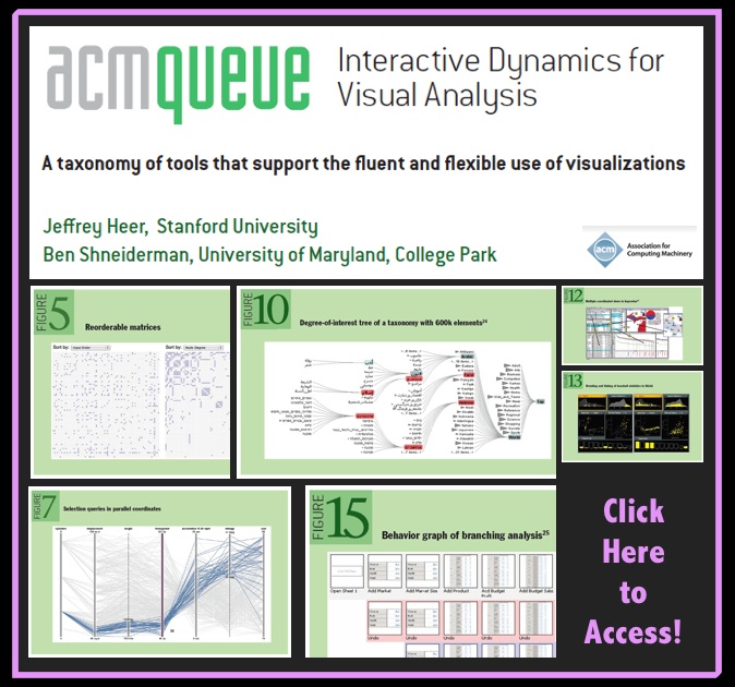
From the Abstract: “The increasing scale and availability of digital data provides an extraordinary resource for informing public policy, scientific discovery, business strategy, and even our personal lives. To get the most out of such data, however, users must be able to make sense of it: to pursue questions, uncover patterns of interest, and identify (and potentially correct) errors. In concert with data-management systems and statistical algorithms, analysis requires contextualized human judgments regarding the domain-specific significance of the clusters, trends, and outliers discovered in data.
Visualization provides a powerful means of making sense of data. By mapping data attributes to visual properties such as position, size, shape, and color, visualization designers leverage perceptual skills to help users discern and interpret patterns within data. A single image, however, typically provides answers to, at best, a handful of questions. Instead, visual analysis typically progresses in an iterative process of view creation, exploration, and refinement. Meaningful analysis consists of repeated explorations as users develop insights about significant relationships, domain-specific contextual influences, and causal patterns. Confusing widgets, complex dialog boxes, hidden operations, incomprehensible displays, or slow response times can limit the range and depth of topics considered and may curtail thorough deliberation and introduce errors. To be most effective, visual analytics tools must support the fluent and flexible use of visualizations at rates resonant with the pace of human thought.
The goal of this article is to assist designers, researchers, professional analysts, procurement officers, educators, and students in evaluating and creating visual analysis tools. We present a taxonomy of interactive dynamics that contribute to successful analytic dialogues.” [HT: Flowing Data]

