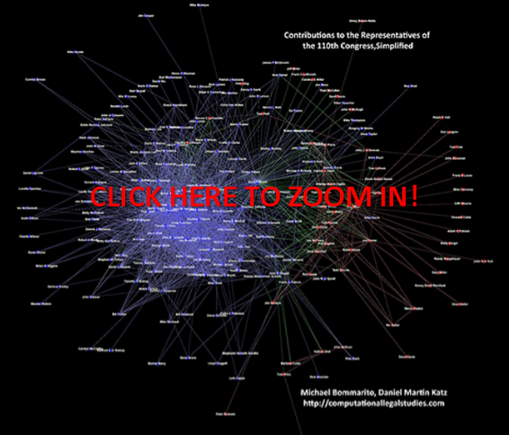
In our previous graph visualizations of contributions to members of the House and Senate, there have been two types of entities: Contributors and Congressmen. This division manifests itself in the dynamics of the graph as well – Contributors give only to Congressmen, and Congressmen receive only from Contributors. A network with this property is bipartite, and there are a number of additional ways to represent the relations contained therein.
One such representation is called the single-mode projection. In this simplification, only elements from one of the two sets (e.g., Congressmen or Contributors) are displayed. A relationship exists between two elements in the visual if they share a relationship with at least one member of the other group. For instance, both Bernie Sanders and Sam Brownback received campaign contributions from the the National Association of Realtors. Thus, the Congressmen both have a relationship with the same Contributor, and the simplest single-mode projection would represent this as a shared relationship between the two Congressmen. For more on this projection or other representations, see Wasserman and Faust (1994) or M. E. J. Newman, S. H. Strogatz, and D. J. Watts, Phys. Rev. E 64, 026118 (2001).
As the Sanders-Brownback example above demonstrates, however, it is relatively easy to be connected in this representation. Thus, we enforce a threshold on the number of shared contributors for a relationship to exist – representatives must shared at least 10 contributors in order for a relationship to exist between them. It is important to note that different thresholds may produce different graphs. We have chosen this figure as it represents roughly half the number of major contributors to the typical representative. Obviously, alternative specifications are possible. In future posts, we may present different thresholds or normalizations. However, for now, we believe this is a simple but appropriate representation for the underlying data.
Given the requirement of sharing at least 10 contributors with another member, the above visualization no longer contains every member of the House of Representatives. To observe the full graph, please see our first post on the contributions to the House.
Interpreting this visual is very similar to previous visuals, and in many ways simpler. Other than points (1) and (2) below, again refer to our first post on the contributions to the House.
(1) SIZING of the CONNECTIONS — Each Connection (Arc) between an Institution and a Member of the House is sized according to the amount of money flowing through a connection. Darker connections represent larger flows of money while lighter connections represent smaller amounts of money.

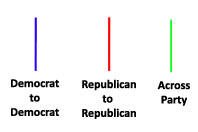
(2) COLORING of the CONNECTIONS — Each connection representing a shared campaign contributor from between members of Congress is colored according to partisan affiliation. Using popular convention, we color shared relationships between Republican Party members as Red, and blue for shared relationships between Democratic Party members. For relationships that span across the party lines, the color green is used.


Have you considered doing any block modeling of the data? I would be interested to so how the donations are clustering; by committee membership, member seniority, legislative activity, etc?
Hey Drew,
Yup, we’ve been looking at taking that analysis to a peer-reviewed environment. We have roll call, Poole Rosenthal scores, etc…One big problem is that getting this committee membership data over time is not built into the OpenSecrets or Sunlight APIs…You can get it by screen-scraping OpenSecrets or collecting it by hand, however.
Excellent graphs! I build something similar to this that would allow campaigns to visualize a graph of their contributions from individuals. Since we had voter info (and in some cases age, sex, etc) for most people we ended up grouping by party, location (city,zip5,zip5+2), employer, spouse information. If you’re interested the link is: http://www.aristotle.com/index.php?option=com_content&task=view&id=232&Itemid=161
Charles Stewart @ MIT has some good resources on historical committee assignments. You might have to piece things together for different, but it seems pretty strong.
http://web.mit.edu/17.251/www/data_page.html
If you’re looking for more recent data (109,110,111) you could also just pull it from GovTrack in XML
http://www.govtrack.us/data/
-jjh
How’s’bout a graphic representation of the monies recvd. relative to how favorably they vote when issues effecting those contributors are before them, whether on the floor or in committee? Another interesting sidebar promulgation along those lines would be the aforementioned stats relative to their public posturing.
One of our State’s Senators has a history of making hay on the local news about Big Pharm and defense spending. When you look at a list of her contributors, the amounts that she receives and her record of favorable votes in their regard it represents a true Alice in Wonderland perspective. One thing that I have noticed is that the party affiliation looses more and more of its significance relative to voting records as the amount of the contributors donations increase. That’s why the smart players always bribe, er… I mean contribute to representatives from both sides of the aisle.
It would seem that the Willie Lynch letter has made the rounds in Congress and they’ve all learned an important lesson. Keep us all divided and fighting amongst themselves and we hardly have time to watch them filling their pockets.