Visualizing Bank Failures ( 2008 – 2009 )

Three Takeaways

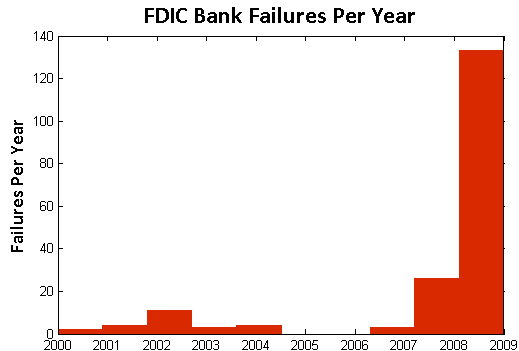
  1. Acceleration: There were four failures in the first six months of 2008, followed by another 22 failures in the next six months.  By January of 2009, there were 21 failures in the first three months of the year, followed by 138 from April to last Friday.
  2. Magnitude: Failures in the past two years have cost the Depositors Insurance Fund an estimated $57B.  The IndyMac failure of July 2008 accounted for $10B alone, followed by BankUnited at $4.9B and Guaranty Banks at $3B.
  3. Spatial Correlation: There is a significant amount of spatial correlation in California, Georgia, Florida, Texas, and Illinois.  These states account for 77% of the total costs to the Depositors Insurance Fund.  Furthermore, most of the losses in California and Georgia were concentrated highly around a few urban centers.

The Movie

The movie below shows the location of bank failures, beginning in 2008 and concluding with the three failed banks from Friday, December 11, 2009. Each green circle corresponds to a bank failure, and the size of each circle corresponds logarithmically to the FDIC’s estimated cost for the Depository Insurance Fund, as stated in the FDIC press releases. For failures with joint press releases, such as the 9 banks that failed on October 30th, the circles are sized in proportion to their relative total deposits.

Our visualization is similar to this one offered by the Wall Street Journal.  For sizing the circles, the WSJ relied upon the value of assets at the time of failure.  By contrast, our approach focuses upon the estimated impact to the Depositors Insurance Fund (DIF). In several instances, this alternative approach leads to a different qualitative result than the WSJ.  For example, consider the case of Washington Mutual. While many have characterized Washington Mutual’s failure as the largest in history, according to the FDIC press release the failure did not actually lead to a draw upon Depositors Insurance Fund.  By contrast, the FDIC estimated cost for the IndyMac Bank failure was substantial– the latest available estimate sets it at 10.7 billion.

Additional Background

As reported in a number of news outlets, Friday witnessed the failure of three more banks – Solutions Bank (Overland Park, KS), Valley Capital Bank (Mesa, AZ), and Republic Federal Bank (Miami, FL).

According to information obtained from the Federal Deposit Insurance Corporation (FDIC), there have been a total of 186 bank failures in the United States since 2000.  Of these, 159 banks or roughly 85% have occurred in the past two years.  The plot below displays the yearly failures since 2000.  These 159 failures over the past two years have cost the Depositors Insurance Fund an estimated $57B.

fdic_failures

In addition to the increase in the rate of bank failures, there has also been a substantial amount of spatial correlation between these failures.  The table below shows the five states with the highest estimated total costs to the Depositors Insurance Fund since 2008.  Together, these five states account for $44B of the total $57B in the past two years.

State Estimated Cost to Fund
California $19.33B
Georgia $9.29B
Florida $6.77B
Texas $4.56B
Illinois $4.12B

Google for Government? Broad Representations of Large N DataSets

picture-24
picture-8

In our previous post, a post which has generated tremendous interest from a variety of sources, we demonstrated how applying the tools of network science can provide a broad representation for thousands of lines of information.  Throughout the 2008 Presidential Campaign then Senator Obama consistently discussed his Google for Government initiative.  

From the Obama for America Website:

Google for Government: Americans have the right to know how their tax dollars are spent, but that information has been hidden from public view for too long. That’s why Barack Obama and Senator Tom Coburn (R-OK) passed a law to create a Google-like search engine to allow regular people to approximately track federal grants, contracts, earmarks, and loans online. 

We agree with both President Obama and Senator Coburn that universal accessibility of such information is worthwhile goal.  However, we believe this is only a first step.  

In a deep sense, our prior post is designed to serve as a demonstration project.  We are just two graduate students working on a shoestring budget.  With the resources of the federal government, however, it would certainly be possible to create a series of simple interfaces designed to broadly represent of large amounts of information.  While these interfaces should rely upon the best available analytical methods, such methods could probably be built-in behind the scenes.   At a minimum, government agencies should follow the suggestion of David G. Robinson and his co-authors who argue the federal government “should require that federal websites themselves use the same open systems for accessing the underlying data as they make available to the public at large.”

Anyway, will be back on Monday providing more thoughts on our initial representation of the 110th Congress.  In addition, we hope to highlight other work in the growing field of Computational Legal Studies.  Have a good rest of the weekend!

Visualizing the Campaign Contributions to Senators in the 110th Congress — The TARP EDITION (The Image)

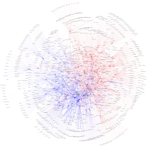
As part of our commitment to provide original content, we offer a Computational Legal Studies approach to the study of the current campaign finance environment.  If you click below you can zoom in and read the labels on the institutions and the senators.   The visualization memorializes contributions to the members of the 110th Congress (2007 -2009).  Highlighted in green are the primary recipients of the TARP.

In the post below, we offer detailed documentation of this visualization.

Three Important Principles: (1) Squares (i.e. Institutions) introduce money into the system and Circles (i.e. Senators) receive money  (2) Both Institutions and Senators are sized by dollars contributed or dollars received  (3) Senators are colored by Party.

To view the full image, please click here.

senators110-thumb1

To view the full image, please click here.


By Michael Bommarito and Daniel Martin Katz.

Center for the Study of Complex Systems
Department of Political Science
University of Michigan, Ann Arbor

Visualizing the Campaign Contributions to Senators in the 110th Congress — The TARP EDITION (Documentation for the Network)


Visualizing the Campaign Contributions to the Senators of the 110th Congress —
The TARP EDITION

By Michael Bommarito & Daniel Katz

University of Michigan
Center for the Study of Complex Systems
Department of Political Science


BASIC OVERVIEW:

110th Congress = January 3, 2007 – January 3, 2009

100 Members of the United States Senate

Click Here for the House of Representatives

BASIC RULE:

Squares (Institutions) Introduce Money into the System and Circles (Senators) Receive Money.

DATA OVERVIEW:

Using recently published data on campaign contributions collected by the Federal Election Commission and aggregated by the Center for Responsive Politics at http://www.opensecrets.org, our visualizations track large money donations to members of the 110th Congress over the 2003-2008 window.

Given that some senators resign or lose reelection, a subset of the senators of the 110th Congress have served less than the full 2003-2008 window. While this imposes some comparability issues, many of these new members faced challenging races and thus attracted significant sums of money.

It is important to note that most of these organizations did not directly donate. Rather, as noted by the Center for Responsive Politics “the money came from the organization’s PAC, its individual members or employees or owners, and those individuals’ immediate families. Organization totals include subsidiaries and affiliates. Of course, it is impossible to know either the economic interest that made each individual contribution possible or the motivation for each individual giver. However, the patterns of contributions provide critical information for voters, researchers and others.” The Center describes its methodology here http://www.opensecrets.org/politicians/method_pop.php.   We strike a tradeoff  between information overload and incomplete disclosure.  To provide for an optically tractable view of the top contributions, we impose the limiting requirement that to be included in our tally a given group’s contribution must fall within a given senator’s top contributor list.  For a first cut on the data, we believe this reaches an appropriate balance.  However, in subsequent work we plan to go much deeper and probe a much larger set of contribution information.   

CONTRIBUTORS & CONTRIBUTIONS:

1,050 of the Donors are captured in the Graph.

Total Recorded Donations Introduced into the System by these Entities Total to  $94, 138,917.

(1) SIZING of the SENATOR NODES — Each Circular node representing a U.S. Senator is sized according the amount of incoming donations. Thus, larger U.S. Senator nodes are the recipients of larger sums of money while the smaller nodes received smaller amounts of money.

pic11

NOTE ON SELF-FINANCING — Some candidates use personal funds to finance their campaigns. For example, Senator Herb Kohl (D-WI) spent $5,922,759 of which $5,575,000 (94%) came from his personal assets. In this respect, Senator Kohl has a significant “self-loop” but is sized very small because he accepts very little outside monies.


(2) COLORING of the SENATOR NODES — Each node representing a US Senator is colored according their Political Party. Using popular convention, we color members of the Republican Party as Red, members of the Democratic Party as Blue and Independents as Purple. For the 110th Congress, there are two Independents—Bernie Sanders (I- VT), Joe Lieberman (I- CT), respectfully.

pic2

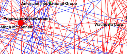
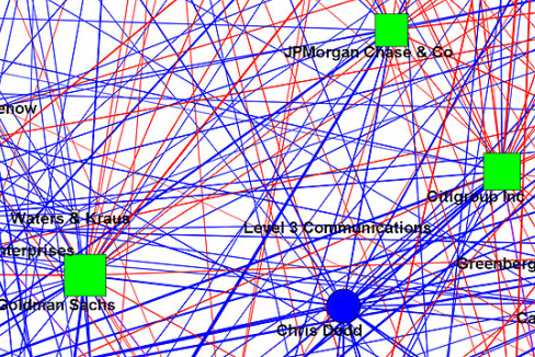
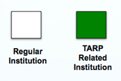
(3) COLORING of the INSTITUTIONAL NODES — Each square node represents institutions who are top contributors to at least one Senator in the 110th Congress. The full graph contains 1,050 institutions of two separate classes. Green institutions are either primary TARP recipients or now components of primary recipients of resources under the Troubled Asset Relief Program. For example, we color Wachovia as Green even though they are now owned by Wells Fargo, a TARP recipient.

pic3

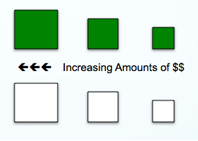
(4) SIZING of the INSTITUTIONAL NODES Each square node representing a TARP or Non-TARP institution is sized according their relative financial contribution to the over all system. Thus, larger institutions make larger contributions and smaller institutions make smaller contributions.

pic4

(5) SIZING of the CONNECTIONS Each Connection (Arc) between an Institution and a Senator is sized according to the amount of money flowing through a connection. Darker connections represent larger flows of money while lighter connections represent smaller amounts of money.

pic5

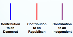
(6) COLORING of the CONNECTIONS — Each connection representing a campaign contribution from an institution to a US Senator is colored according to partisan affiliation of the receiving senator. Using popular convention, we color members of the Republican Party as Red, members of the Democratic Party as Blue and Independents as Purple. For the 110th Congress, there are two Independents—Bernie Sanders (I- VT), Joe Lieberman (I- CT), respectfully.

pic6

(7) STRUCTURE OF THE GRAPH The Graph is Visualized Using the Kamada-Kawai Visualization Algorithm.  This is an automated spring embedded, force directed placement algorithm often used in the network science literature to visualize graphs of this size.

(8) ACKNOWLEDGEMENTS  We thank Rick Riolo, Jon Zelner, Carl SimonScott Page and the Center for Responsive Politics for their comments, contributions and/or data.