University of Michigan
Center for the Study of Complex Systems
Department of Political Science
BASIC OVERVIEW:
110th Congress = January 3, 2007 – January 3, 2009
100 Members of the United States Senate
Click Here for the House of Representatives
BASIC RULE:
Squares (Institutions) Introduce Money into the System and Circles (Senators) Receive Money.
DATA OVERVIEW:
Using recently published data on campaign contributions collected by the Federal Election Commission and aggregated by the Center for Responsive Politics at http://www.opensecrets.org, our visualizations track large money donations to members of the 110th Congress over the 2003-2008 window.
Given that some senators resign or lose reelection, a subset of the senators of the 110th Congress have served less than the full 2003-2008 window. While this imposes some comparability issues, many of these new members faced challenging races and thus attracted significant sums of money.
It is important to note that most of these organizations did not directly donate. Rather, as noted by the Center for Responsive Politics “the money came from the organization’s PAC, its individual members or employees or owners, and those individuals’ immediate families. Organization totals include subsidiaries and affiliates. Of course, it is impossible to know either the economic interest that made each individual contribution possible or the motivation for each individual giver. However, the patterns of contributions provide critical information for voters, researchers and others.” The Center describes its methodology here http://www.opensecrets.org/politicians/method_pop.php. We strike a tradeoff between information overload and incomplete disclosure. To provide for an optically tractable view of the top contributions, we impose the limiting requirement that to be included in our tally a given group’s contribution must fall within a given senator’s top contributor list. For a first cut on the data, we believe this reaches an appropriate balance. However, in subsequent work we plan to go much deeper and probe a much larger set of contribution information.
CONTRIBUTORS & CONTRIBUTIONS:
1,050 of the Donors are captured in the Graph.
Total Recorded Donations Introduced into the System by these Entities Total to $94, 138,917.
(1) SIZING of the SENATOR NODES — Each Circular node representing a U.S. Senator is sized according the amount of incoming donations. Thus, larger U.S. Senator nodes are the recipients of larger sums of money while the smaller nodes received smaller amounts of money.

NOTE ON SELF-FINANCING — Some candidates use personal funds to finance their campaigns. For example, Senator Herb Kohl (D-WI) spent $5,922,759 of which $5,575,000 (94%) came from his personal assets. In this respect, Senator Kohl has a significant “self-loop” but is sized very small because he accepts very little outside monies.
(2) COLORING of the SENATOR NODES — Each node representing a US Senator is colored according their Political Party. Using popular convention, we color members of the Republican Party as Red, members of the Democratic Party as Blue and Independents as Purple. For the 110th Congress, there are two Independents—Bernie Sanders (I- VT), Joe Lieberman (I- CT), respectfully.

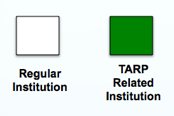
(3) COLORING of the INSTITUTIONAL NODES — Each square node represents institutions who are top contributors to at least one Senator in the 110th Congress. The full graph contains 1,050 institutions of two separate classes. Green institutions are either primary TARP recipients or now components of primary recipients of resources under the Troubled Asset Relief Program. For example, we color Wachovia as Green even though they are now owned by Wells Fargo, a TARP recipient.

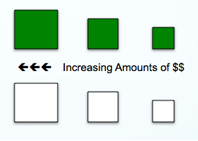
(4) SIZING of the INSTITUTIONAL NODES — Each square node representing a TARP or Non-TARP institution is sized according their relative financial contribution to the over all system. Thus, larger institutions make larger contributions and smaller institutions make smaller contributions.

(5) SIZING of the CONNECTIONS — Each Connection (Arc) between an Institution and a Senator is sized according to the amount of money flowing through a connection. Darker connections represent larger flows of money while lighter connections represent smaller amounts of money.

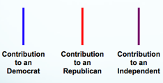
(6) COLORING of the CONNECTIONS — Each connection representing a campaign contribution from an institution to a US Senator is colored according to partisan affiliation of the receiving senator. Using popular convention, we color members of the Republican Party as Red, members of the Democratic Party as Blue and Independents as Purple. For the 110th Congress, there are two Independents—Bernie Sanders (I- VT), Joe Lieberman (I- CT), respectfully.

(7) STRUCTURE OF THE GRAPH — The Graph is Visualized Using the Kamada-Kawai Visualization Algorithm. This is an automated spring embedded, force directed placement algorithm often used in the network science literature to visualize graphs of this size.
(8) ACKNOWLEDGEMENTS — We thank Rick Riolo, Jon Zelner, Carl Simon, Scott Page and the Center for Responsive Politics for their comments, contributions and/or data.

Wonderful work! I’d be interested in learning more about the visualization tools you used.
I’ve been using NodeXL http://www.codeplex.com/NodeXL, which is an open source Excel add-in; as a beginner in this area I found it a great way to get up the curve quickly. However, you may be coding your own visualizations, which will always be more customized
Thanks for you comment. We generally use IGraph to generate visualizations.
Nice work but I’m going to complain anyway. It would be better if there was a way to select one node and see only links for that node. E.g. select one senator and see his contributions. Also nice would be a way to directly access the underlying data. Sort of a Google streetview for data, then go back to the main map. I know this is asking a lot.
Thanks for your comment. I think these suggestions are good. Granted we cannot do everything but we have talked about doing suggestion #1 hope to do so down the line.
I think the graphic would be more ‘visualizable’ creating 3 columns, ABC, A: Party red senators circles, B, TARP squares, and C Party blue circles, order changeable by any column