
Tag: campaign contribution
Visualizing Contributions to the 110th Congress—House Edition (Take 2)

In our previous graph visualizations of contributions to members of the House and Senate, there have been two types of entities: Contributors and Congressmen. This division manifests itself in the dynamics of the graph as well – Contributors give only to Congressmen, and Congressmen receive only from Contributors. A network with this property is bipartite, and there are a number of additional ways to represent the relations contained therein.
One such representation is called the single-mode projection. In this simplification, only elements from one of the two sets (e.g., Congressmen or Contributors) are displayed. A relationship exists between two elements in the visual if they share a relationship with at least one member of the other group. For instance, both Bernie Sanders and Sam Brownback received campaign contributions from the the National Association of Realtors. Thus, the Congressmen both have a relationship with the same Contributor, and the simplest single-mode projection would represent this as a shared relationship between the two Congressmen. For more on this projection or other representations, see Wasserman and Faust (1994) or M. E. J. Newman, S. H. Strogatz, and D. J. Watts, Phys. Rev. E 64, 026118 (2001).
As the Sanders-Brownback example above demonstrates, however, it is relatively easy to be connected in this representation. Thus, we enforce a threshold on the number of shared contributors for a relationship to exist – representatives must shared at least 10 contributors in order for a relationship to exist between them. It is important to note that different thresholds may produce different graphs. We have chosen this figure as it represents roughly half the number of major contributors to the typical representative. Obviously, alternative specifications are possible. In future posts, we may present different thresholds or normalizations. However, for now, we believe this is a simple but appropriate representation for the underlying data.
Given the requirement of sharing at least 10 contributors with another member, the above visualization no longer contains every member of the House of Representatives. To observe the full graph, please see our first post on the contributions to the House.
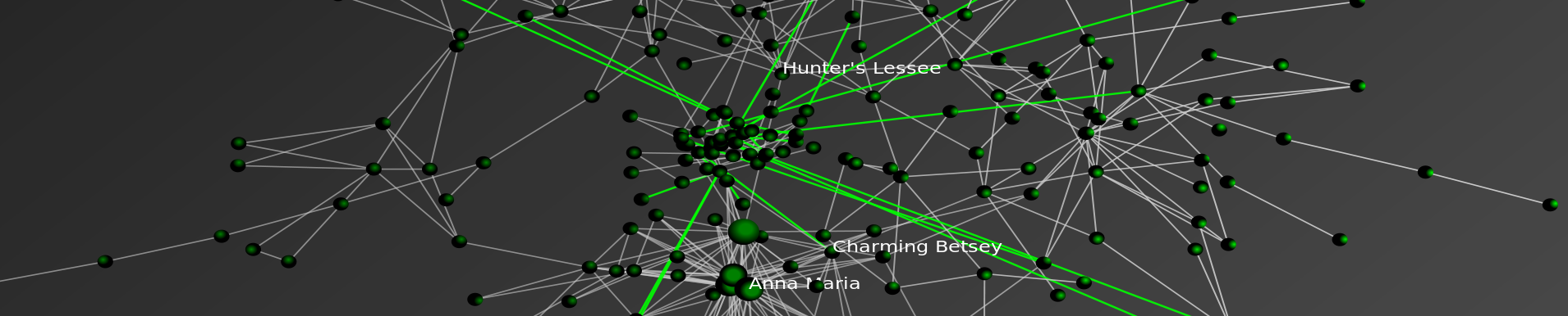
Interpreting this visual is very similar to previous visuals, and in many ways simpler. Other than points (1) and (2) below, again refer to our first post on the contributions to the House.
(1) SIZING of the CONNECTIONS — Each Connection (Arc) between an Institution and a Member of the House is sized according to the amount of money flowing through a connection. Darker connections represent larger flows of money while lighter connections represent smaller amounts of money.

(2) COLORING of the CONNECTIONS — Each connection representing a shared campaign contributor from between members of Congress is colored according to partisan affiliation. Using popular convention, we color shared relationships between Republican Party members as Red, and blue for shared relationships between Democratic Party members. For relationships that span across the party lines, the color green is used.

Senators of the 110th Congress Take 2-Contributions by Industry/Sector
To view the full image, please click here.

This represents a deeper cut on campaign contributions to the Senators of 110th Congress. Again, we rely upon data from the Center for Responsive Politics. The CRP aggregates contribution data up to the industry or economic sector. Thus, as before, we adopt their classification scheme and methodology herein. While aggregating to the industry/sector level removes the degree of specificity we offered in our earlier post, it provides a cleaner representation for the graph. For those interested in the other chamber, click here for the House of Representatives.
Click on the picture above and it will take you to our flash where you can zoom in and read the labels.
As you review the graph, please consider the following:
(1) Industries locate in the center of the graph because they provide significant funding to both Democrats and Republicans.
(2) Industries which generally only fund one political party are located toward the respective red/blue boundary. For example, it is hardly surprising to observe the location of “Oil and Gas” relative to “Environmental” groups.
(3) It is important to note that we do not impose the partisan separation or the placement of party outliers apparent in the image. Rather, the algorithm places Red Senators in Blue Territory and Blue Senators in Red Territory because they receive significant sums from industries who typically fund the opposing party. For example, consider Senator Olympia J Snowe (R-ME) who is typically characterized as a moderate Republican. Since she receives money from more industries that typically fund Democrats than Republicans, she is placed in Blue Territory by the algorithm.
(4) It is important not to over read the position of Senator Herb Kohl (D-WI). Over the relevant time window, Senator Kohl received 94% of his resources through self-financing.